Beginner
35 mins
Teacher/Student led
+115 XP

What you need:
Chromebook/Laptop/PC

Text Formatting

In this lesson, you'll learn how to format text to create a disco poster. You'll explore different font styles, sizes, colors, and more!
Teacher Class Feed

Load previous activity

    1 - Access the Disco Poster

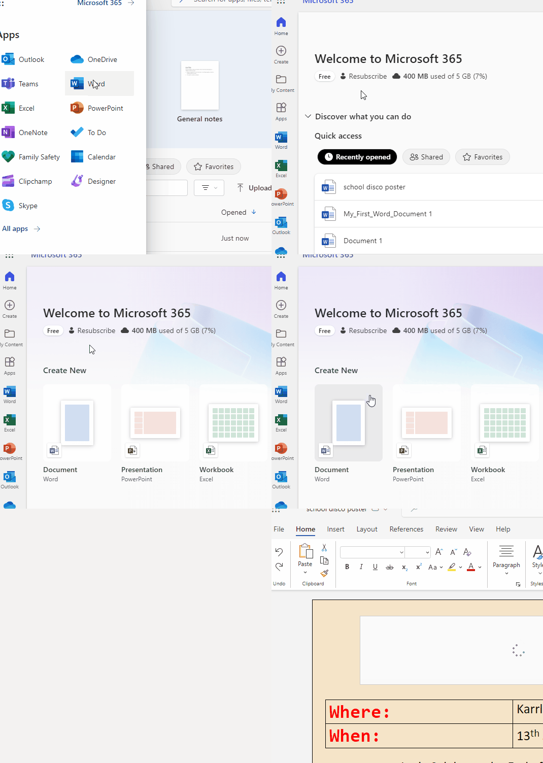
    Open the Word document you created in the previous lesson for the school disco poster.

    You can go to "Recently Opened" to find your doc, or browse to where you "save as" your school disco poster.


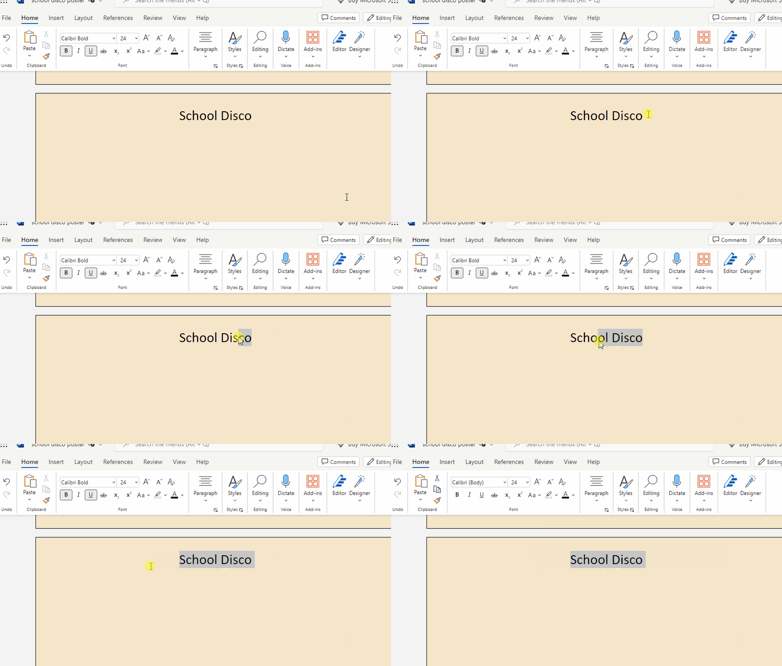
    2 - Select the Title

    Shortly, you will be selecting your title so that you can change the font.

    Why is Font Important?

    Fonts play a vital role in design. They set the mood and style of your poster. In this lesson, we'll explore how to work with fonts creatively.

    To Do:

    1. Click and drag to highlight the title of your disco poster.

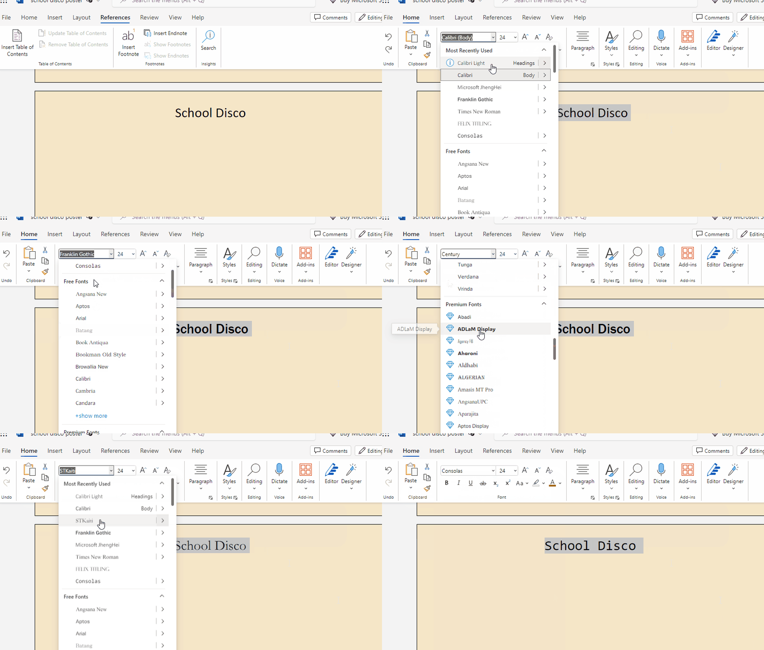
    3 - Change Font Style

    1. Highlight the text you want to change (e.g., the event title).
    2. In the "Home" tab, look for the "Font" group. Click the drop-down arrow next to the font name to see a list of available fonts.
    3. Hover over each font to see a live preview of how it looks in your document.
    4. Select a font that fits the disco theme of your poster.

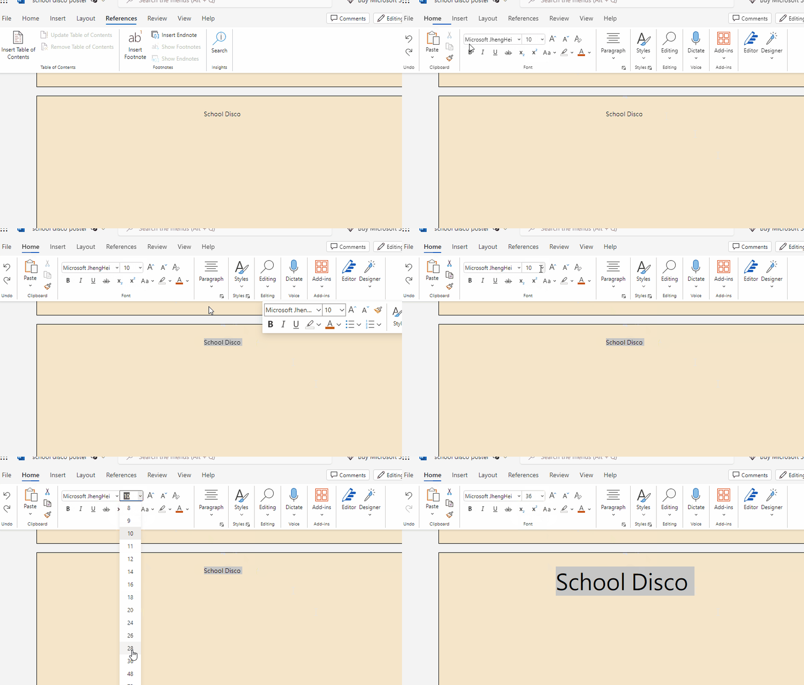
    4 - Change Font Size

    Is Font Size a Necessity?

    Font size can be a game-changer in design. It helps important information stand out and sets the visual hierarchy of your poster.

    Since the last lesson you added in details about yours document's event such as time, location. Type more content in about your event.

    Identify the most crucial information on your poster, such as the event date or time.

    1. Highlight this text.
    2. In the "Home" tab, locate the "Font Size" option in the "Font" group.
    3. Click the drop-down arrow next to "Font Size."
    4. Hover over the font sizes to see a live preview of how they look.
    5. Adjust the font size to make the important text larger and more eye-catching.
    6. Step back and take a look at your poster. Make sure the adjusted font size fits well with the overall design and doesn't overwhelm the other elements.

    Secondary Important Information

    1. Highlight this text.
    2. Is this text as large in size as your crucial information?
    3. If so, slightly increase the font size to create a visual hierarchy while maintaining readability.


    123learn · Online learning platform

    Unlock the full learning experience

    You're previewing this lesson. Get full access to this lesson and hundreds more — each one ready to teach, with interactive activities, printable resources and pupil progress tracking built in.

    Hundreds of curriculum-aligned lessons
    Interactive activities in every lesson
    Printable resources & progress tracking
    Copyright Notice
    This lesson is copyright of Coding Ireland 2017 - 2026. Unauthorised use, copying or distribution is not allowed.
    🍪 Our website uses cookies to make your browsing experience better. By using our website you agree to our use of cookies. Learn more