1 - Introduction ~5 mins
Welcome
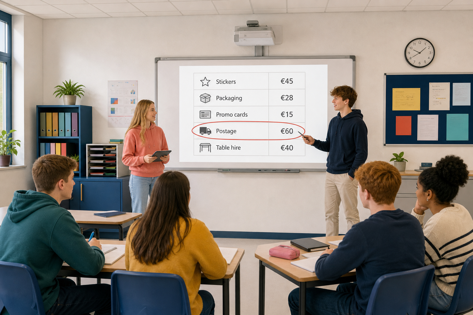 A list of costs is useful. A bar chart of those same costs is often faster to read: the tallest bar is the biggest spend, the shortest bar is the smallest, and you can see the shape of the budget in one glance. Today you will turn real project numbers into your first bar chart and save it as the start of your charts workbook for Key Assignment 2.
By the end of this lesson, you will be able to:
- Select a data range and insert a bar chart in Excel for the web and Google Sheets
- Explain what the chart shows and change the chart type if needed
- Move and place a chart on the sheet cleanly
- Build a bar chart of costs by item and save the workbook as {{code:06_ka2_charts}} in the {{code:06_charts}} folder
Warm-up
Look at five cost figures written as a list. Without doing any maths, which item would you guess costs the most, and which would you check first if you had to cut spending? Keep that instinct in mind: a bar chart is built to answer that kind of question in seconds.
| Item | Cost (€) |
|---|---|
| Stickers | 45 |
| Packaging | 28 |
| Promo cards | 15 |
| Postage | 60 |
| Table hire | 40 |
If you need a five-row rebuild later, use the same shape: Item in column A, Cost (numbers only, no € sign in the cell) in column B.
2 - Key Concepts ~6 mins
Two ideas you will click today: the data range (labels plus numbers the chart reads) and a column chart (vertical bars that compare costs side by side). The table below is a quick reference card for the full lesson, not a long read-aloud.
| Concept | Why it matters | Example |
|---|---|---|
| Data range — the block of cells the chart reads from (usually labels plus numbers) | If you select the wrong cells, the chart will plot the wrong story or include empty rows | Selecting Item names in column A and Cost values in column B for a side-hustle setup budget |
| Bar / column chart — a chart that compares values with bars; vertical bars are often called columns, horizontal bars are true bar charts | Best tool when you want to compare sizes side by side (costs by item, votes by option, hours by task) | Postage as the tallest bar and promo cards as the shortest in a five-item setup cost chart |
| Chart title — a short label that says what the chart is about | A chart without a title forces the reader to guess; a clear title makes the decision obvious | "Setup costs by item (€)" on a phone-case side-hustle sheet |
| Chart type — the style of chart (column, bar, pie, line, and others) | The same data can look clear or confusing depending on the type you pick | Costs by item suit a column chart; share of a total often suits a pie chart (next lesson) |
| Moving a chart — dragging the chart object so it sits cleanly on the sheet without covering your data | A chart parked on top of numbers is hard to print, hard to read, and looks unfinished | Dragging the chart under the data table so Item and Cost stay visible beside it |
Sample chart you are about to build
Worked example data (Aoife's custom phone-case side hustle, setup costs):
| Item | Cost (€) |
|---|---|
| Stickers | 45 |
| Packaging | 28 |
| Promo cards | 15 |
| Postage | 60 |
| Table hire | 40 |
Predict the bars (30 seconds): before you insert anything, rank the five costs from tallest bar to shortest in your head. After the chart appears, check whether your ranking matched.
After the chart is built, you should be able to say in one sentence: Postage is the biggest setup cost; promo cards are the smallest.
3 - Step-by-step Task ~15 mins
Build a practice bar chart from Aoife's five setup costs. Follow the tabs for your spreadsheet app. You will select the data, insert a column chart, title it, move it, and try one chart-type change so you know where the control lives. Keep this file as practice only: later you will create a separate Key Assignment file.
4 - Common Issues ~4 mins
Common Issues
| Issue | Solution |
|---|---|
| My chart has no item names on the axis | You probably selected only the Cost column. Select both columns together (Item labels and Cost values), including the heading row, then insert the chart again. |
| The Insert chart button seems greyed out or nothing happens | Click inside the sheet and select the data range first. Charts need a selected range before Insert will build one. |
| My chart is sitting on top of my numbers | Click the chart border (not a single bar) and drag it below or beside the table until every cell is readable again. |
| Excel offered a line chart or weird chart type | Open the chart type gallery and pick clustered column (vertical bars). Empty rows or mixed text in the Cost column can also confuse the suggestion: clear blanks and keep costs as numbers only. |
| The tallest bar is not the item I expected | Check the raw Cost cells for typos (60 typed as 6, or a euro symbol inside the cell turning the value into text). Fix the number, and the chart updates. |
| My live budget has extra columns, blanks, or € signs | Copy only the Item and Cost columns (including the heading row). Paste into the new sheet starting at A1. Delete blank rows in the middle. If a cost shows as €60 or "60 euro", retype it as the plain number 60 so the chart can read it. |
| I cannot find my practice file vs my KA file | Practice stays named {{code:practice_bar_chart}}. Key Assignment work must be a new file named exactly {{code:06_ka2_charts}} in {{code:06_charts}}. Do not rename the practice file. |
5 - Portfolio Build ~20 mins
Portfolio Build (teacher-paced)
- Create the file: Open {{code:Project_Portfolio}} → {{code:06_charts}}. If the folder is missing, tell your teacher. New spreadsheet → rename to {{code:06_ka2_charts}}.
- Get your data: Open {{code:05_project_budget}} beside it. Copy Item names and Cost figures only (at least five real project items), including the heading row. Paste into {{code:06_ka2_charts}} at A1. If you have no budget file, build a five-row Item / Cost table from your Something Real project now (numbers only in the Cost column).
- Insert the chart: Select the full range with headings → Insert a column or bar chart (same path as practice).
- Title with your project name: Give the chart a plain-English title that names your project (for example "[Project] setup costs by item (€)").
- Move the chart so it sits below the data and does not cover any cells.
- Decision sentence: In a free cell beside or under the table (for example D1), type one line: Biggest cost: ___ — I should ___. Name the tallest and shortest bars and what each means for your budget.
Quick checklist (both apps): Open {{code:05_project_budget}} → New workbook {{code:06_ka2_charts}} in {{code:06_charts}} → copy Item + Cost only → select range with headings → Insert column chart → title with project name → move below data → write decision sentence.
- {{code:06_ka2_charts}} sits in your {{code:06_charts}} folder with your own project Item and Cost data (not the practice sample)
- A column or bar chart shows costs by item and uses a clear title that mentions your project
- The chart sits cleanly on the sheet so the data table stays fully readable
- A one-line decision sentence names the biggest cost and what you should do next (cut, keep, or investigate)
Unlock the full learning experience
You're previewing this lesson. Get full access to this lesson and hundreds more — each one ready to teach, with interactive activities, printable resources and pupil progress tracking built in.
This lesson is copyright of Coding Ireland 2017 - 2025. Unauthorised use, copying or distribution is not allowed.