Today you will
- find out if your slides can be read from the back of the room.
- check your deck against a short readability list.
- fix {{code:07_project_pitch}} so it passes the list.
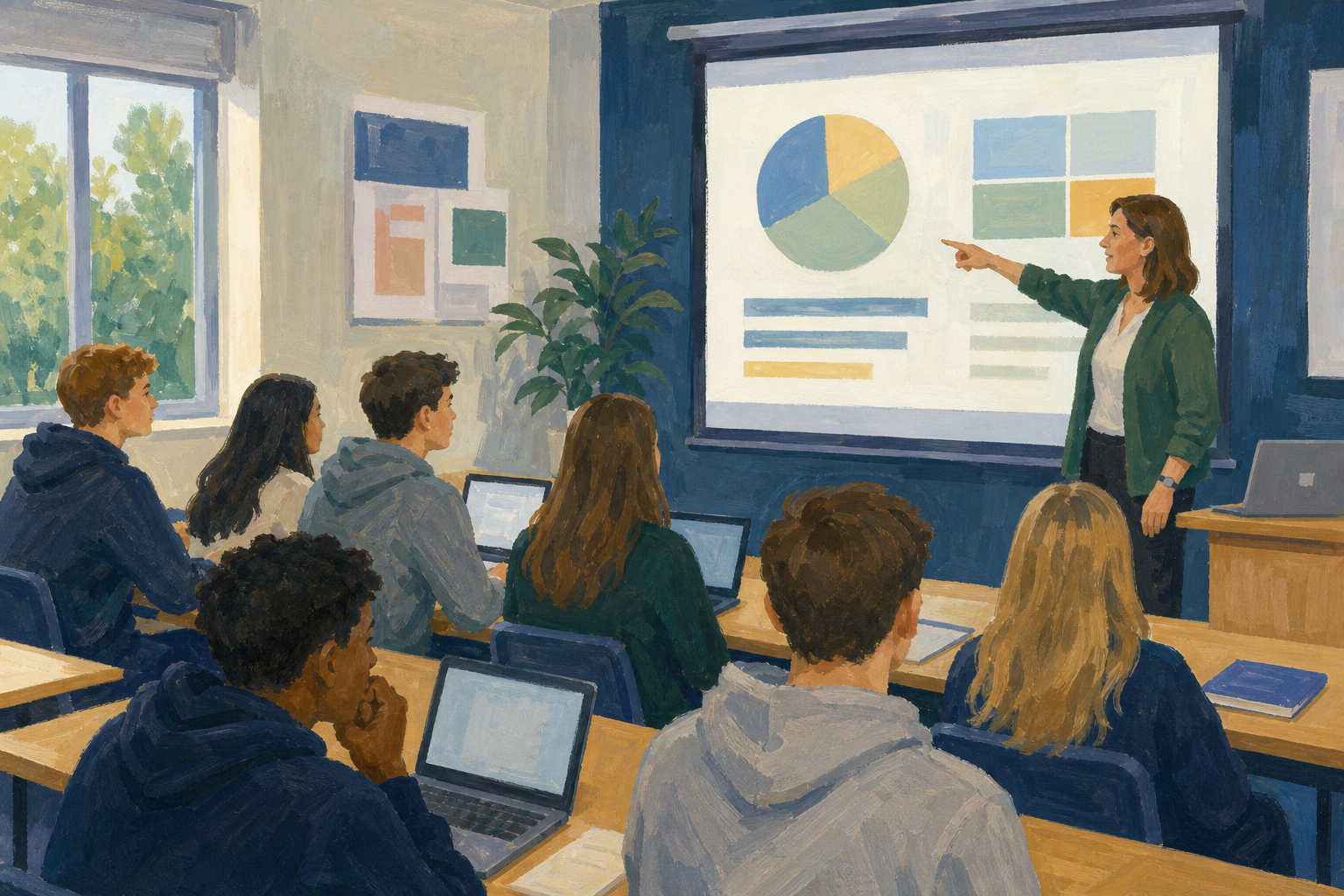 If you can't find {{code:07_project_pitch}}, tell your teacher now.
Warm-up
Think of the last presentation you sat through. What made one slide easy to read at a glance?
Font size: body text should be 24 pt or bigger, and titles should be bigger again.
Contrast: use dark text on a light background, or light text on a dark one.
Less is more: put one main idea on each slide, with about six words on a line.
Talk to the room: the slide holds short prompts, and you tell the story out loud.
Example
The slide says "Budget gap: €120". You explain out loud how you will close it.
Place your marker for each statement. There's no right answer, so be ready to say why you stood there. It's fine to change your mind after you listen to others.
Interactive activity
Common issues
- My text looks tiny on the big screen. Make body text 24 pt or bigger, and cut words so it still fits.
- It looks pale on the classroom screen. Use dark text on a plain light background, and take busy photos out from behind the text.
- I don't know what to cut. Keep the main point on the slide and say the rest out loud.
Watch the fix
Watch your teacher fix one crowded slide. You will do the same steps on your own deck next.
- Make the body text 24 to 28 pt, and make the title bigger.
- Use dark text on a plain light background.
- Take the busy photo out from behind the words.
- Cut the paragraph down to three short bullets.
- Check the slide against the readability list.
Unlock the full learning experience
You're previewing this lesson. Get full access to this lesson and hundreds more — each one ready to teach, with interactive activities, printable resources and pupil progress tracking built in.
This lesson is copyright of Coding Ireland 2017 - 2025. Unauthorised use, copying or distribution is not allowed.