Intermediate
60 mins
Teacher/Student led
+65 XP

Graphs and Data Tables

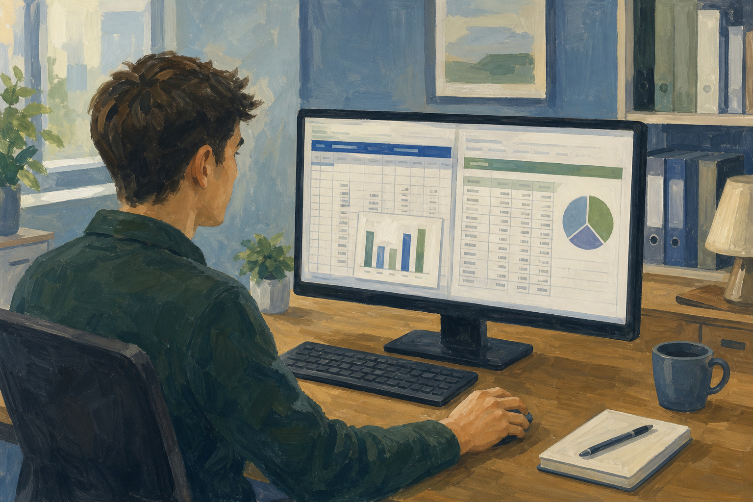
Create a clean page showing both a chart and its data table. Format the table with banded rows and borders, align numbers, and place the chart beside the table without overlap. This prepares professional-looking evidence pages for projects or reports.

Teacher Class Feed

Load previous activity

    1 - Introduction ~5 mins

    Welcome

    A chart grabs attention, but a reader who needs the exact figure still reaches for the numbers. Today you will build one clean page that shows both: a chart beside a properly formatted data table, ready for a supervisor, mentor, or assessor to read at a glance.

    This layout is the kind of evidence page you can drop into a Work Experience log, a small-enterprise update, or supporting material for your VET interview.

    By the end of this lesson, you will be able to:

    • Pair a chart with a readable companion data table
    • Format banded rows, borders, and aligned numbers so the table is easy to scan
    • Place chart and table cleanly together on one sheet

    Warm-up

    Think of a chart from your Something Real project, Work Experience hours, or the ticket sample you will build today. If someone asked for the exact week-3 total, could they get it from the chart alone, or would they need the numbers written out beside it?

    No chart yet? Use the community-event ticket example we will build next: the same question still applies.

    2 - Key Concepts ~6 mins

    Before you format anything, lock in four ideas that turn a rough sheet into a page someone else can read without asking you to explain it.

    ConceptWhy it mattersExample
    Companion data table — the exact figures that sit under (or beside) a chart so the reader can check totals, not just the shape of the barsCharts show pattern; tables show precision. Sponsors, supervisors, and assessors often need both on one pageWeek 5 climbs on the chart; the table shows exact €140 revenue
    Banded rows — alternating light row colours across a table so the eye can track across a line without slippingOn a busy sheet, unbanded rows make people misread a value from the row above or belowLight grey on alternate Work Experience hour rows locks Friday to Friday
    Borders and number alignment — thin grid lines around cells, with numbers right-aligned (and currency formatted where money is involved)Left-aligned numbers look like labels; right-aligned numbers line up by place value and read as quantities€60, €90, €75 stacked with euro signs and decimals lining up
    One-page layout — chart and table sized and placed so both fit on one screen (and later one printed page) without overlappingIf the chart covers the table, or the table is shoved three screens down, the pair fails and the reader only sees half the storyTable in A–C, chart from column E, both visible without sideways scroll

    Next: you will build a 5-week ticket stall page.

    3 - Step-by-step Task ~15 mins

    Build a one-page chart-plus-table sheet for a community event ticket stall. You will enter the data, format the table (banded rows, borders, aligned currency), insert a column chart, and park the chart beside the table so both read together.

    Follow the tab for your spreadsheet app. Your teacher will demo the first few formatting clicks on the classroom screen, then you continue on your own machine.

    4 - Common Issues ~4 mins

    Common Issues

    IssueSolution
    My chart is sitting on top of the data and I cannot read the tableClick the chart once so handles appear, then drag it to the right of the table (near column E). Resize from a corner handle if it still overlaps
    Banded rows did not appear, or the header looks the same as the dataExcel: re-select {{range:A1:C6}}, use Format as Table, and tick "My table has headers". Sheets: re-select the range and use Format → Alternating colors with the header option left on
    Euro amounts look messy or sit on the left of the cellSelect the Revenue column, apply Currency (€), then Align right. Check you formatted values, not the heading cell
    The chart plotted the wrong columns (for example Revenue as categories)Delete the chart and re-select only the intended columns (for the sample, Week + Tickets sold). Insert the column chart again from that tighter range
    I cannot find {{code:sm3_chart_data_page}} afterwardsCheck you created the file from inside {{code:Project_Portfolio}} → {{code:09_specialism}} → {{code:sm3}}. Online apps save where the file was created, not in a random Downloads folder. Excel Online may show .xlsx in the title; Sheets keeps its own type under the same base name

    5 - Independent Practice ~20 mins

    Independent Practice

    Your goal: Build one clean page that pairs a chart with a readable data table for your Something Real project, so a supervisor or assessor can see both the trend and the exact figures without asking you to explain the sheet.
    Time: ~20 minutes
    Task: Open {{code:Project_Portfolio}} → {{code:09_specialism}} → {{code:sm3}}. If you want to keep the ticket sample as a reference, make a copy of the walkthrough sheet first, then work in a file named {{code:sm3_chart_data_page}} inside {{code:sm3}} (Excel Online may show .xlsx; Sheets uses the same base name). Replace the ticket-stall sample with at least five rows of your own data. Use Something Real figures if you have them; otherwise use Work Experience hours, small-enterprise costs, club or match counts, or content-view totals. Keep banded rows, borders, and right-aligned numbers, and sit a chart beside the table on the same page for later SM3 KA2 use. The file you submit must show your data, not weeks 1–5 tickets.
    Success criteria:
    • The sheet shows your own non-sample data (at least 5 rows) in a table that is easy to scan at a glance
    • Numbers are clearly formatted and lined up; money uses euro formatting where it applies
    • A chart sits beside the table on the same page without covering any cells
    • The file is saved in {{code:sm3}} as {{code:sm3_chart_data_page}} (Excel Online: {{code:sm3_chart_data_page.xlsx}}; Google Sheets: base name only)
    123learn · Online learning platform

    Unlock the full learning experience

    You're previewing this lesson. Get full access to this lesson and hundreds more — each one ready to teach, with interactive activities, printable resources and pupil progress tracking built in.

    Hundreds of curriculum-aligned lessons
    Interactive activities in every lesson
    Printable resources & progress tracking
    Copyright Notice
    This lesson is copyright of Coding Ireland 2017 - 2025. Unauthorised use, copying or distribution is not allowed.
    🍪 Our website uses cookies to make your browsing experience better. By using our website you agree to our use of cookies. Learn more