Advanced
60 mins
Teacher/Student led
+65 XP

Design Principles: Layout, Hierarchy, Whitespace

Learn four essential design principles to make your documents look clear and professional. Fix a sample community notice using Contrast, Repetition, Alignment and Proximity, then redesign one of your own portfolio documents for better readability.

Teacher Class Feed

Load previous activity

    1 - Introduction ~5 mins

    Welcome

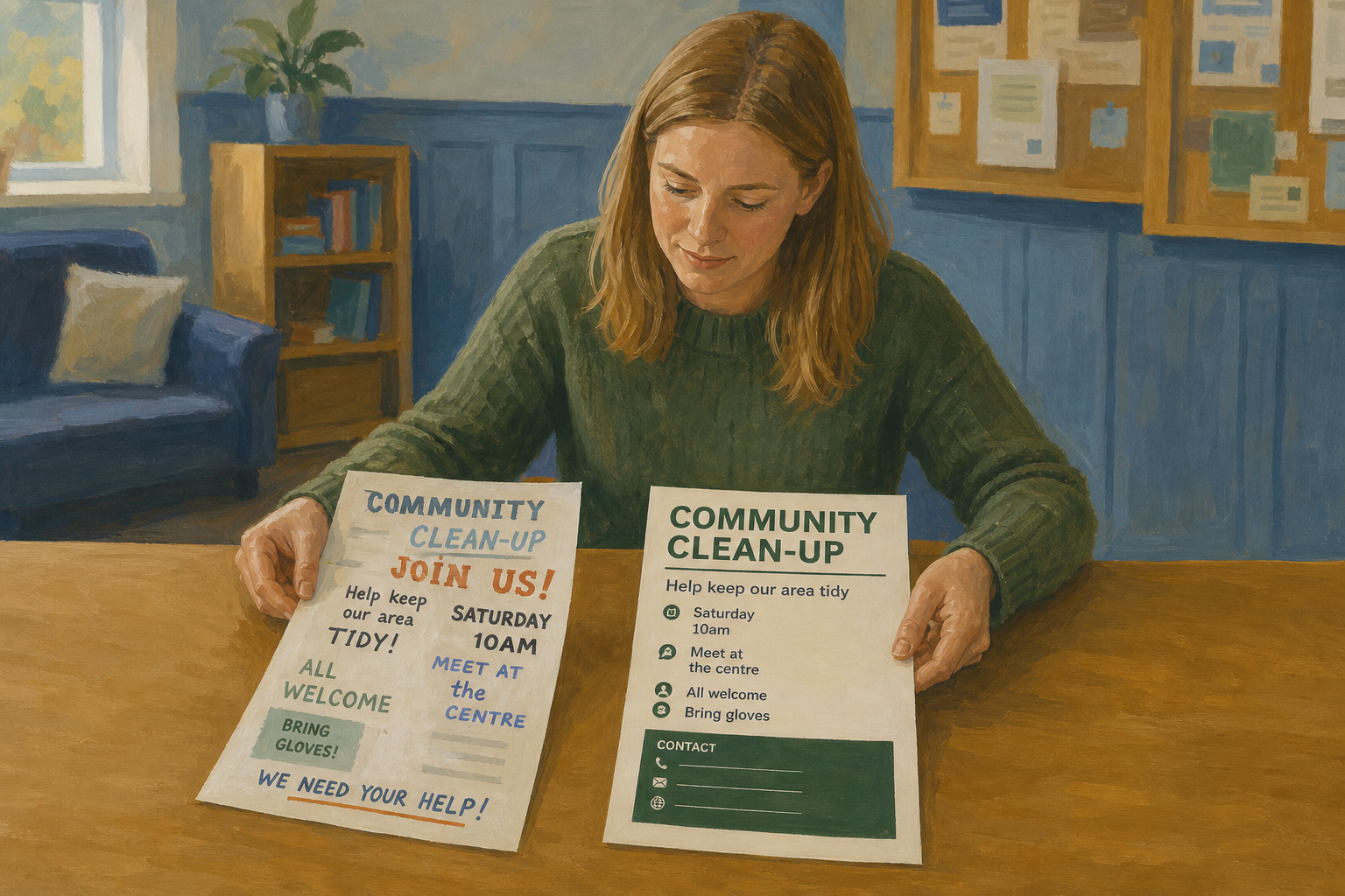
    Illustration for IntroductionA document can say all the right things and still look unfinished. Today you learn four design principles that make a page feel clear and professional: Contrast, Repetition, Alignment, and Proximity (often remembered as CRAP). You will fix a rough sample first, then redesign one of your own Something Real documents so a real reader can scan it in seconds.

    By the end of this lesson, you will be able to:

    • Apply Contrast, Repetition, Alignment, and Proximity (CRAP) to a document
    • Improve visual hierarchy and whitespace for a professional feel
    • Revise one existing portfolio document using design principles

    Warm-up

    In pairs, 30 seconds each: name one document that looked professional and one that looked messy (a flyer, WhatsApp graphic, school notice, or Work Experience handout). What pulled your eye first: a bold title, clear spacing, or a tidy layout? You will use the same idea on your own portfolio work today.

    Need a document later? If you do not yet have a finished SM1 Something Real document, you will personalise today's sample and still save a full redesign as {{code:sm1_doc5_crap_applied.docx}}.

    2 - Key Concepts ~6 mins

    These four principles come from Robin Williams' design guide The Non-Designer's Design Book. You do not need fancy tools. You need deliberate choices about size, consistency, edges, and space.

    CRAP in one sentence: make the important thing stand out (Contrast), keep choices consistent (Repetition), line things up (Alignment), and group related content with space between groups (Proximity).

    What you get when CRAP works (not two extra rules to memorise): hierarchy means the eye hits title, then key facts, then details; whitespace means deliberate gaps from paragraph spacing, not random empty lines. Your teacher will project messy vs clean while you glance the table below — do not try to learn every cell first.
    ConceptWhy it mattersExample
    Contrast — make important elements clearly different (size, weight, or colour) Readers decide in seconds what matters; weak contrast forces them to hunt 22 pt bold title vs 11 pt body
    Repetition — reuse the same fonts, heading sizes, colours, and spacing rules Consistency makes a document feel intentional rather than thrown together Same Heading 2 on every section label
    Alignment — line elements up to a shared edge instead of placing them at random Aligned edges calm the page and make scanning faster All body text flush to one left margin
    Proximity — group related items close together; leave clear space between groups Space tells the reader what belongs together without extra words Name, phone, email as one tight block

    Glance back at the table during the demo if you forget a name. The live messy-to-clean flyer is the real teacher.

    3 - Step-by-step Task ~15 mins

    Open the messy one-page sample Saturday Skills Swap (already typed for you as {{code:sm1_crap_demo.docx}}). Apply Contrast, Repetition, Alignment, and Proximity so the page feels professional. This is the model for the portfolio document you will redesign next. Keep the finished demo in {{code:Project_Portfolio/09_specialism/sm1/01_drafts}} and leave it open beside your later redesign.

    4 - Common Issues ~4 mins

    Common Issues

    IssueSolution
    I changed five fonts and three colours and it still looks messy Reset to two fonts maximum (or one font family with bold for headings). Pick one accent colour. CRAP is restraint, not decoration.
    My page has huge empty regions and still feels cramped in places Use paragraph spacing and clear section gaps, not random blank lines. Group related lines tightly, then put one deliberate gap between sections.
    Heading styles look different from my classmate's That is fine if each heading level is consistent inside your own document. Check that every Heading 2 matches the others in size, weight, and colour.
    I cannot find Align left or paragraph spacing In Word Online use the Home ribbon: alignment icons and the Line and paragraph spacing control (1.15, then Add space after paragraph). Layout Before/After fields are an optional backup only if they appear. In Google Docs use the toolbar align icons and {{menu:Format -> Line & paragraph spacing}}.

    5 - Independent Practice ~20 mins

    Independent Practice

    Your goal: Redesign one Something Real page with CRAP so a real reader (teacher, supervisor, club contact, or customer) can scan it quickly and take it seriously.
    Time: ~20 minutes
    Task: Open {{code:Project_Portfolio/09_specialism/sm1}}. Choose one finished SM1 document tied to your Something Real project that is a one-page notice or short letter close to the demo shape. Make a copy, move or save the copy into {{code:03_finished}}, and rename it {{code:sm1_doc5_crap_applied.docx}} (Word Online may show .docx; Google Docs will not — both are fine). Keep the content truthful; you are redesigning layout, not inventing a new topic.

    Extension file types only if your page is already simple: short newsletter, light table page, or mail-merge letter. If your page is denser than the demo, still do only the four checklist moves on title, headings, left edge, and section gaps — do not rebuild the whole layout.

    If you have no finished SM1 document: open {{code:sm1_crap_demo.docx}}, make a copy, personalise it as a notice for your Something Real project (real title, date/place, roles, and your contact details), apply the same CRAP moves, and save that copy as {{code:sm1_doc5_crap_applied.docx}} in {{code:03_finished}}.

    Do this checklist (match {{code:sm1_crap_demo.docx}}):
    1. Strengthen the title versus body (size and bold)
    2. Use the same style on every section heading
    3. Left-align body text to one shared edge
    4. Group related lines tightly and add deliberate space between sections

    Same moves, different page: on a newsletter, strengthen the masthead title and match section labels; on a letter, strengthen the subject or opening line and group the address or sign-off block.

    If the clock is tight: land a stronger title, matching headings, and one tight contact or facts block — that already reads more professional than the draft you started with.

    Success criteria:
    • {{code:sm1_doc5_crap_applied.docx}} is saved in {{code:Project_Portfolio/09_specialism/sm1/03_finished}} (copy of a real project document, or a personalised Skills Swap notice if that was your fallback)
    • A reader can tell the title, section headings, and body apart at a glance (clear hierarchy)
    • Headings, fonts, and spacing choices feel consistent across the page rather than random
    • Related details sit together and sections have deliberate breathing room between them
    123learn · Online learning platform

    Unlock the full learning experience

    You're previewing this lesson. Get full access to this lesson and hundreds more — each one ready to teach, with interactive activities, printable resources and pupil progress tracking built in.

    Hundreds of curriculum-aligned lessons
    Interactive activities in every lesson
    Printable resources & progress tracking
    Copyright Notice
    This lesson is copyright of Coding Ireland 2017 - 2025. Unauthorised use, copying or distribution is not allowed.
    🍪 Our website uses cookies to make your browsing experience better. By using our website you agree to our use of cookies. Learn more