Beginner
60 mins
Teacher/Student led
+125 XP
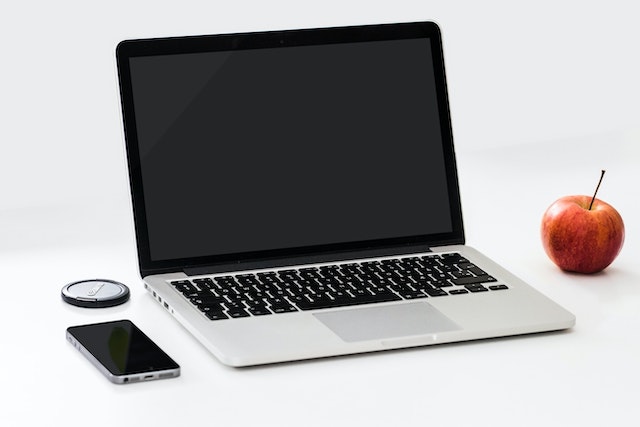 Chromebooks, laptops, and PCs are crucial tools for coding and digital skills education. Chromebooks are ideal for web-based applications and collaborative projects, while laptops and PCs support a wider range of programming environments and software for more intensive tasks like software development and data analysis.
Creating a Bar Chart
In this lesson, you will learn how to create a colorful bar chart to display data in a fun and exciting way!