1 - Introduction ~5 mins
The same numbers can look calm or alarming on a chart. Today you spot two tricks and build honest charts.
By the end of this lesson, you will be able to:
- Spot a cut axis and a crowded pie
- Choose column or pie for the question
- Add labels, zero baseline and a finding title
- Place two honest charts on {{code:08_charts}}
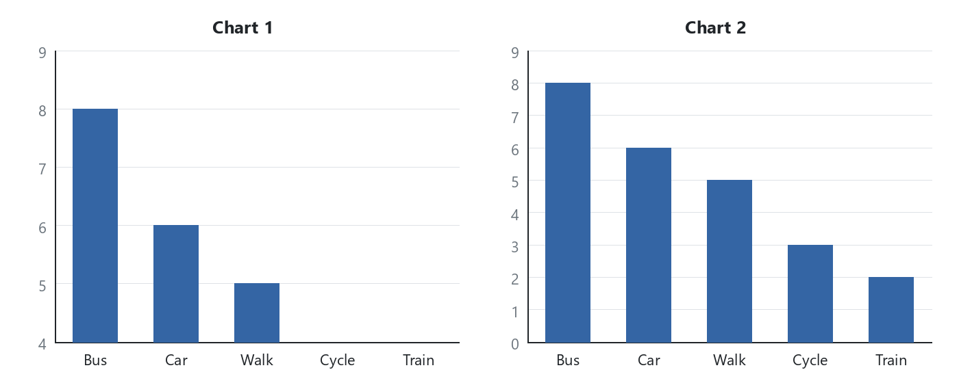
Same counts, two stories. Which would you send to student council?
2 - Key Concepts ~5 mins
| Concept | Why it matters | Example |
|---|---|---|
| Column vs pie: column compares groups; pie shows few parts of a whole | Wrong type hides the answer | Transport counts: column; Yes/Maybe/No: pie |
| Zero baseline: value axis starts at 0 | A cut axis makes a small gap look huge | Axis from 4 makes Bus look four times Walk |
| Crowded pie: too many thin slices | Readers guess instead of comparing | Fourteen mixed slices hide the pattern |
| Finding title: states what the data shows | Busy readers get the point fast | "Bus leads (8 of 24)" beats "Transport" |
3 - Explore: Which Chart Misleads? ~6 mins
Three charts use the same sample transport counts (Bus 8, Car 6, Walk 5, Cycle 3, Train 2). Study each image, then complete the self-check.
Chart A
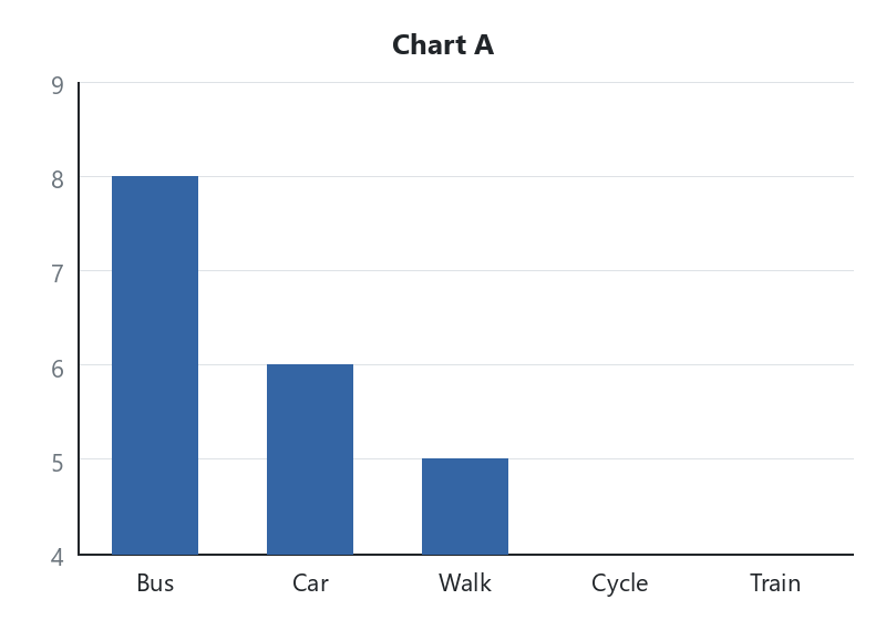
Column chart. The vertical axis starts at 4, so Cycle and Train vanish and Bus looks about four times as tall as Walk, even though the real gap is only three answers.
Chart B
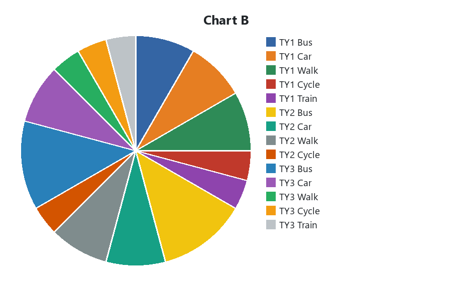
Pie with fourteen thin slices, one for every Class and Transport mix. The parts are almost impossible to compare.
Chart C
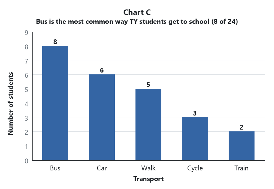
Column chart of the same five counts. Axis starts at 0. Clear axis titles, data labels, and the title "Bus is the most common way TY students get to school (8 of 24)".
Self-check (about two minutes)
- Chart A misleads because…
- Chart B misleads because…
- Chart C helps a busy reader because…
Finish each stem in your head or on a sticky note. When the timer ends, be ready if your teacher asks for one line. No need to type this into your sheet.
4 - Step-by-step Task: Honest Charts ~18 mins
Build two honest charts on sheet {{code:08_charts}} from the sample transport and cycling counts. Slow down for the zero baseline and a title that states the finding. Must-finish: the column chart with zero baseline, full labels and a finding title. If you have time: the three-slice pie (about five more minutes). Follow the steps for your suite.
5 - Common Issues ~3 mins
Common Issues
| Issue | Solution |
|---|---|
| Axis still starts above zero? | That is the usual snag. Set the value axis minimum to 0. |
| Pie has too many tiny slices | Use pie only for a few parts; otherwise switch to column |
| Title only names the field | Rewrite as a short finding (who led, by how many) |
| Wrong chart type by accident | Change it in Chart type. No need to delete and start again |
| Chose a bar chart instead of column? | Set the horizontal axis minimum to 0 (value axis lies sideways on a bar chart) |
Unlock the full learning experience
You're previewing this lesson. Get full access to this lesson and hundreds more — each one ready to teach, with interactive activities, printable resources and pupil progress tracking built in.
This lesson is copyright of Coding Ireland 2017 - 2025. Unauthorised use, copying or distribution is not allowed.