1 - Introduction ~5 mins
Welcome
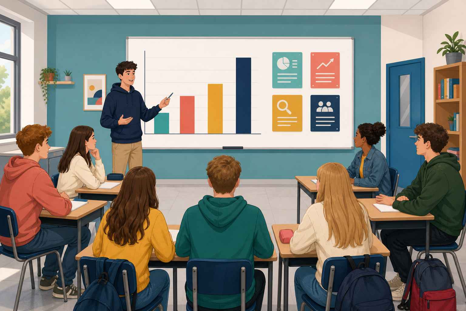 {{img:img_interpretation_template}}
If your bar and pie charts in {{code:06_ka2_charts}} already show the numbers, today is about reading them: biggest, smallest, proportions, and what decision they push you toward for your Something Real project. If a chart is still missing, flag your teacher before the Portfolio Build so you can still write a full interpretation. A chart that nobody can explain is just decoration.
By the end of this lesson, you will be able to:
- Read bar and pie charts at a glance for biggest value, smallest value, and proportions
- Write a short interpretation that supports a real project decision
- Separate what a chart shows from what it does not show
- Add a 3–4 sentence interpretation under each chart in {{code:06_ka2_charts}}
Warm-up
Look at any bar chart you have seen recently (a sports table, a budget, a social media insight). Without reading a single number, what did you notice first: the tallest bar, a colour, or a label? That first glance is the skill we lock in today before you write under your own charts.
2 - Key Concepts ~8 mins
First, glance-read: the tallest bar or largest slice is the main story; on a pie, also notice roughly how big each share is of the whole. Then write using the same four beats every time.
| Concept | Why it matters | Example |
|---|---|---|
| What it shows — one plain sentence naming the measure and the categories | Readers need the topic before any opinion | The bar chart compares euro cost for each item in the first production run |
| Biggest and smallest — highest and lowest values named in words (and figures if you have them) | Those two anchors usually drive the first budget or plan decision | Biggest cost is packaging at €85; smallest is labels at €6 |
| Proportion — how large a share is of the whole (especially on a pie) | Answers “where is most of the money, time, or effort going?” in one look | Materials take about half the pie; advertising is a thin slice |
| Decision — one clear action the chart supports for your project | SEC work and real stakeholders care what you will do with the data | “Because materials dominate the pie, I will price the starter pack higher and cut one low-value add-on.” |
{{img:img_interpretation_template}}
Worked example: four-sentence interpretation
Fictional student Aoife is building a custom keyring side hustle. Her bar chart lists item costs; her pie chart shows spend by category.
Under the bar chart:
- What it shows: The bar chart compares euro cost for each item in the first production run.
- Biggest: Metal blanks are the highest single cost at €42.
- Smallest: Jump rings are the lowest at €4.
- Decision: I will order blanks in a larger pack to cut unit cost, and keep jump rings as a low-risk line I can restock often.
Honesty line (optional fifth sentence): This chart shows cost only, not which item customers prefer.
Under the pie chart:
- What it shows: The pie chart shows how total spend splits by category for the same run.
- Biggest: Materials take the largest share, about half the pie.
- Smallest: Postage is the smallest slice, roughly one tenth.
- Decision: I will keep materials quality high and look for a cheaper local post option rather than cutting product quality.
{{img:img_overclaim_warning}}
Notice what she does not claim: she does not say blanks are “most important to customers” or that postage “does not matter”. The chart only shows cost and share of cost.
That is the whole job: four plain sentences. You do not need fancy language; you need an honest read that ends in an action.
Weak write-up versus strong write-up
| Weak (colour only) | Strong (four beats) |
|---|---|
| “This is a blue bar chart of costs. It looks neat.” | Aoife’s four sentences above: what it shows, biggest, smallest, decision. |
If you finish early later, the matching sheet “Chart claims: match the idea” is a quick check of these terms.
3 - What Can This Chart Claim? ~14 mins
Place your marker on each statement. There is no single score. Be ready to say what a chart can support and what it cannot. Changing your mind after hearing someone else is part of the work.
- If one bar is twice as tall as another, that item is twice as important to the project.
Think about: What does “important” mean here: cost, time, quality, or customer value? - A pie chart with eight thin slices is still easy to read at a glance.
Think about: When do too many slices stop helping and start cluttering? - A cost chart alone can tell you exactly what to cut from a budget.
Think about: What does a cost chart leave out (quality, sales, deadlines, safety)? - The most useful line in a chart write-up is the decision, not the description of the colours.
Think about: What does a weak ending sound like compared with a decision sentence?
Interactive activity
4 - Common Issues ~3 mins
Common Issues
| Issue | Solution |
|---|---|
| My write-up only describes colours and chart type | Use the four beats: what it shows, biggest, smallest, decision. Colour is optional; the decision line is not. |
| I wrote “this proves customers prefer X” | Check the axis and the data. A cost or quantity chart does not measure preference unless preference was what you counted. {{img:img_overclaim_warning}} |
| Biggest and smallest feel obvious so I skipped them | Name them in words with the values if you can. Readers who only glance still need the two anchors written down. |
| I do not know what decision to write | Ask: if I only keep one change after reading this chart, what is it? Cut a cost, raise a price, reorder stock, drop a category, ask a supervisor for help. |
5 - Portfolio Build ~20 mins
Portfolio Build
- Both charts in {{code:06_ka2_charts}} have a short written interpretation in empty rows directly under them
- Each interpretation names what the chart shows plus biggest and smallest in plain words
- Each interpretation ends with one clear project decision the chart supports
- Nothing in the write-up claims a fact the chart cannot show (optional honesty line used where needed)
- This chart shows…
- The biggest value is… at…
- The smallest is…
- So for my project I will…
- This chart does not show…
Stuck on the decision sentence? Ask yourself: if I change only one thing after reading this chart, what is it? Cut a cost, raise a price, reorder stock, drop a category, or ask a supervisor. One concrete action is enough; it does not need to be perfect.
Before you log off: show both interpretations on screen for a quick teacher check. File stays {{code:06_ka2_charts}} in the {{code:06_charts}} folder.
Early finishers: complete the matching sheet “Chart claims: match the idea”, or tighten wording and add one honesty line on a chart limit.
Unlock the full learning experience
You're previewing this lesson. Get full access to this lesson and hundreds more — each one ready to teach, with interactive activities, printable resources and pupil progress tracking built in.
This lesson is copyright of Coding Ireland 2017 - 2025. Unauthorised use, copying or distribution is not allowed.