Today you will
- set one font for headings and one for body text
- make body text easy to read
- use bold and italic only where they help
- tidy up your own project document
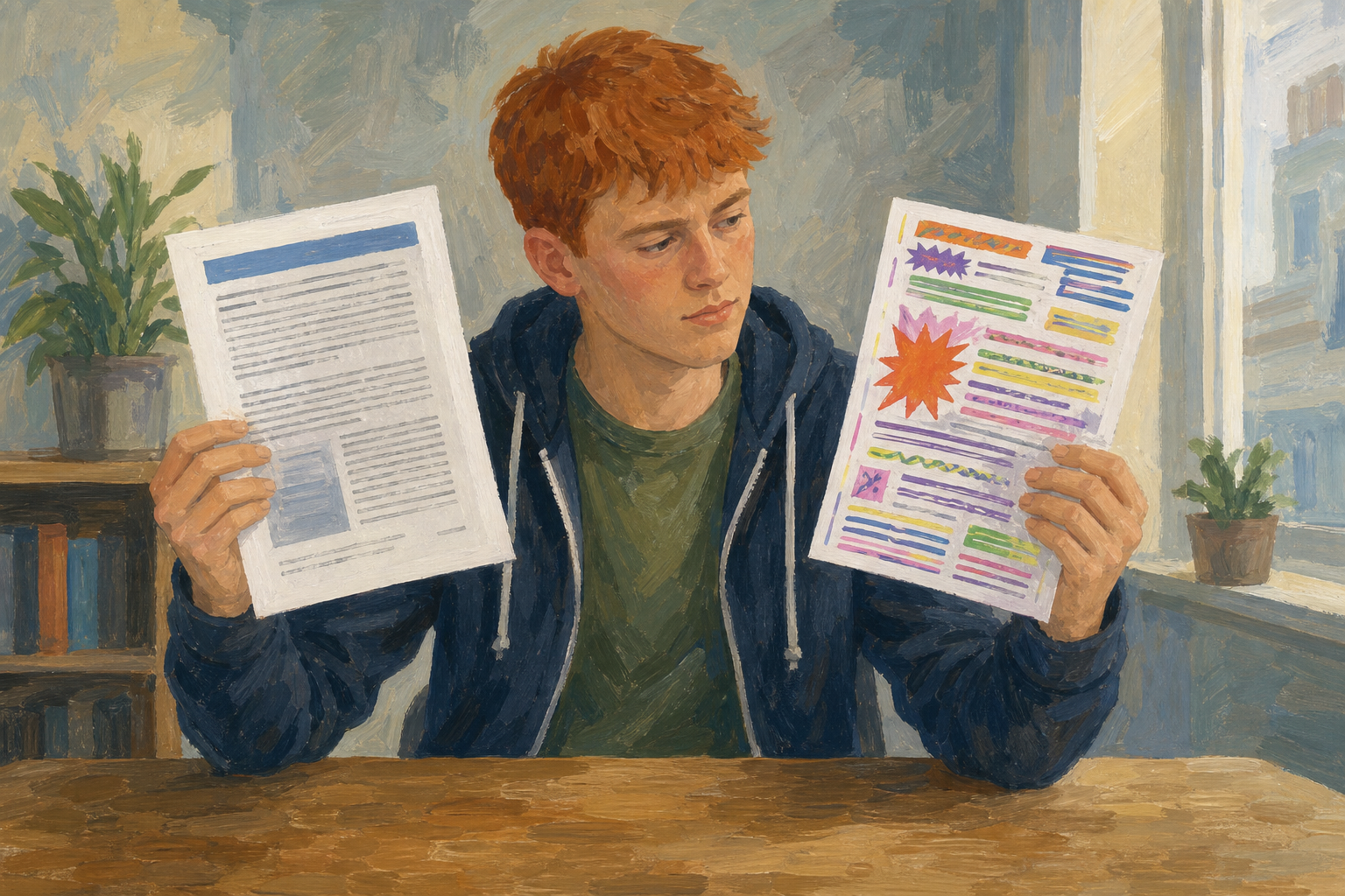
Your teacher will show the same paragraph twice. One is clean and one is messy. Which one would you hand to your Work Experience supervisor? Put your hand up for it.
Three rules
- Two fonts maximum: use one font for headings and one font for body text.
- Readable size: body text should be 10 to 12 pt.
- Emphasis with a purpose: bold one short phrase the reader must notice, and don't underline body text.
Arial has plain letters, which is good for headings. Georgia has small feet on the letters, which makes long text easy to read.
Example: the clean target
- Heading: Arial, 16 pt, bold
- Body: Georgia, 11 pt, no colour, no underline
You will make a short practice page called {{code:sm1_formatting_practice}}. Watch your teacher first, then follow the steps in the box below.
Type or paste this text into your new document:
Match-day photo pitch
I offer club match-day photos for local GAA teams. Packages cover warm-up, key scores, and a short winner set delivered within 48 hours. Sample galleries are available on request for club secretaries planning the next championship weekend.
When you finish, swap screens with a partner. Name one thing that follows the rules and one thing that is still messy.
Common issues
- Only one word changed. Select the whole paragraph again, then choose the font again.
- I can't find Georgia or Arial. Type the name into the font box. If Georgia is still missing, use Times New Roman for body text.
- Bold won't turn off. Select the text and click {{btn:B}} again.
Independent Practice
- In {{code:03_finished}}, find {{code:sm1_doc1_from_template.docx}}.
- Make a copy and name it {{code:sm1_doc1_from_template_v2}}.
- Set every heading to Arial, 16 pt, bold.
- Set the body text to Georgia, 11 pt.
- Take out extra colour and underlines. Then keep just one or two bold or italic marks.
If your file is missing or almost empty, make a new document called {{code:sm1_doc1_from_template_v2}} and type this text:
Work Experience placement report
I completed a two-week placement in May with a local business, working three days on the shop floor and two days in the office. My main tasks were checking stock deliveries, answering the counter phone, and updating the customer contact list. The skill I improved most was speaking to customers I had never met before, and my supervisor's written comments are available on request.
- I use only two fonts.
- My body text is 10 to 12 pt.
- My body text is dark, with no underline and one or two bold or italic marks at most.
- {{code:sm1_doc1_from_template_v2}} is saved in {{code:03_finished}}.
Unlock the full learning experience
You're previewing this lesson. Get full access to this lesson and hundreds more — each one ready to teach, with interactive activities, printable resources and pupil progress tracking built in.
This lesson is copyright of Coding Ireland 2017 - 2026. Unauthorised use, copying or distribution is not allowed.