Intermediate
60 mins
Teacher/Student led
+65 XP

Advanced Text Formatting: Professional Headline Colour

Learn to apply one professional colour and at most one light text effect to a newsletter headline. Understand that more formatting does not always mean better design. Practise selecting appropriate finishes and critiquing over-the-top styles on Word Online and Google Docs.

Teacher Class Feed

Load previous activity

    1 - Introduction ~5 mins

    Welcome

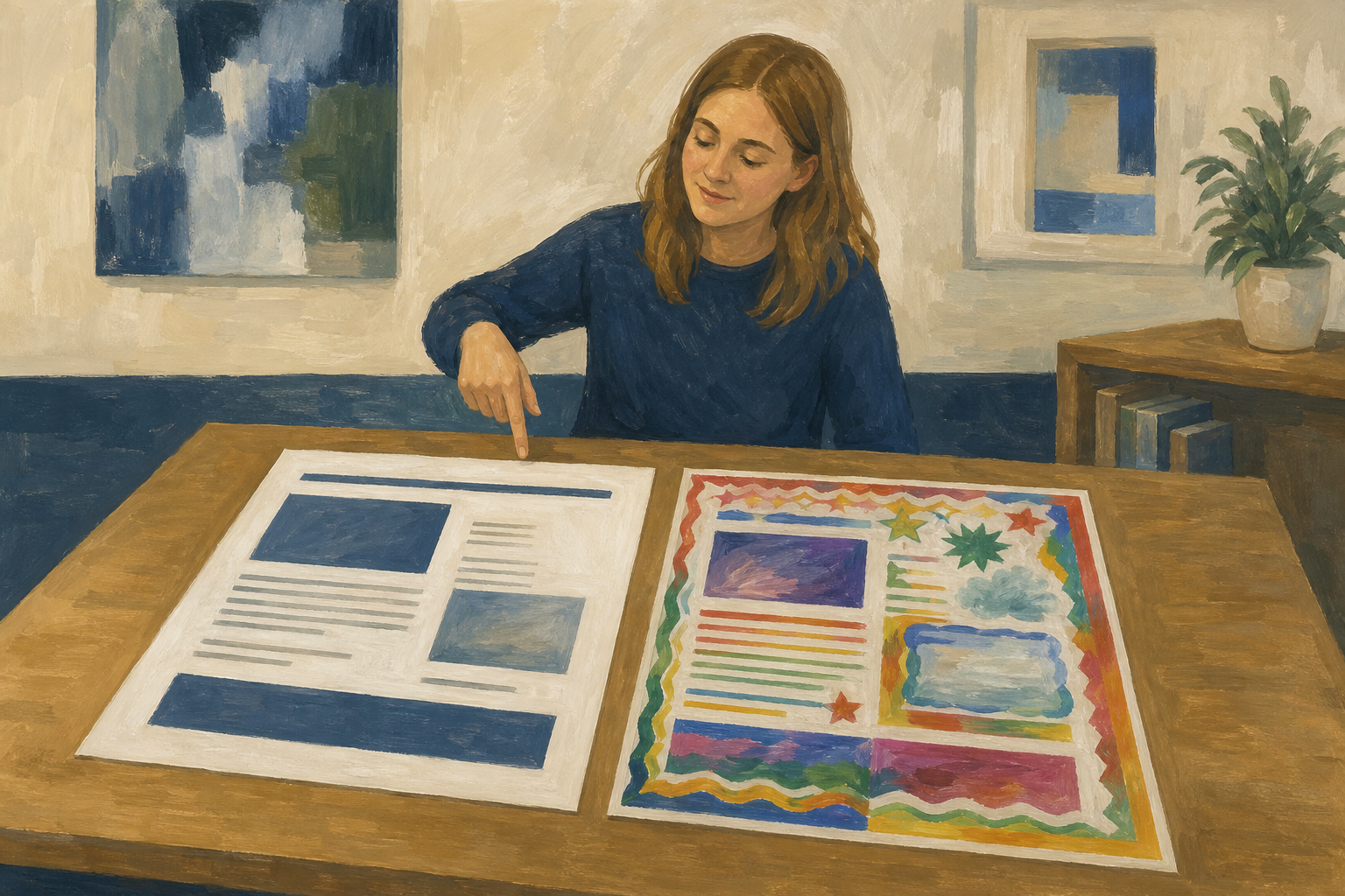
    Illustration for IntroductionToday you give a newsletter headline one calm professional finish: colour, and at most one light effect if your app offers it. The skill is not pressing every button available. It is knowing which one button is enough.

    You will practise first on a short sample page your teacher shares. If you already have {{code:sm1_doc2_newsletter.docx}} from the columns lesson, you will apply the same treatment to that file later in the period.

    By the end of this lesson, you will be able to:

    • Apply one professional colour and at most one light effect (where the tool allows) to a headline
    • Apply the rule that capability does not equal good design
    • Critique over-the-top versus restrained effect use

    Word Online or Google Docs — both are fine today

    • Word Online: Heading style + one professional colour (add a soft effect only if you clearly see Text Effects).
    • Google Docs: Heading 1 + one professional colour = the full finish for today.

    Warm-up

    Think of a title you have seen this week: a shop sign, a TikTok caption, a club poster, or a Work Experience flyer. Did the styling help you read it faster, or did it slow you down? Keep that answer in mind while you work today.

    2 - Key Concepts ~6 mins

    Key point

    Advanced text formatting is useful when one title needs to carry the page. Use it sparingly. Body text stays plain.

    Before and after (same words)

    • Restrained (keep this): Heading style, one deep colour, at most one soft effect if the tool has it. Body text left black and plain.
    • Over the top (avoid this): Rainbow, thick outline, glow, underline, all caps, and tight spacing on the same line.
    Today

    Today: restrained version on the headline only.

    ConceptWhy it mattersExample
    Text colour — pick one deep colour for the headline instead of default black.A single strong colour on a headline signals hierarchy before the reader has read a wordA navy headline on a Work Experience placement report for a local garage reads cleaner than neon green
    Light text effect — optional soft shadow only if your app clearly offers it.One light effect can lift a headline; stacking several effects makes the document look unfinished. Colour alone is enough when effects are limitedA soft grey shadow under a small-enterprise pitch title, with no outline and no glow — or navy Heading 1 only in Google Docs
    Restrained design rule — the software can do more than you should use.Readers judge professionalism in seconds; noisy styling undercuts a strong idea before they reach your first sentenceCompare a clean GAA club fundraiser header with one that uses five colours, outline, shadow, and underline at once

    3 - Step-by-step Task ~15 mins

    Follow the steps for your word processor. Open the short practice page your teacher shared, apply Heading 1 plus one professional colour to the headline only, then check that body text stays plain. Your teacher will show the key clicks on the classroom screen first.

    Full pass rule: If you do not see Text Effects, you are finished after colour. That is a full pass today.

    4 - Common Issues ~4 mins

    Common Issues

    IssueSolution
    The colour or effect applied to the whole page, not just the titlePress {{kbd:Ctrl+Z}} (Windows/Chromebook) or {{kbd:Cmd+Z}} (Mac) once, then carefully drag to select only the headline before trying again
    I cannot find Text Effects in Word Online or Google DocsUse one strong professional colour on a Heading style instead. That still counts as the full restrained finish for today's goal
    My headline looks loud even with only one colourChoose a darker, calmer colour, remove any outline or glow if you added them, and keep body text completely plain so the title has room to breathe
    The body text changed size or colour when I styled the titleSelect the body paragraphs, set the style back to Normal, and set text colour to black or Automatic

    5 - Independent Practice ~20 mins

    Independent Practice

    Your goal: Give your class, enterprise, or placement newsletter one calm, professional headline treatment so a real reader notices the title first and still trusts the rest of the page.
    Time: ~20 minutes
    Task: Keep {{code:sm1_text_effects_practice}} open beside you and match that level of restraint (headline only). Open your {{code:Project_Portfolio}} folder and open {{code:sm1_doc2_newsletter.docx}} from {{code:09_specialism/sm1/}} if you have it. If you do not have that file, tell your teacher and stay on the short practice page or blank newsletter template instead. Style only the main full-width title at the top of the page, not article subheadings. Use the same approach as the practice page: one professional colour and at most one light effect, or a clean colour-only finish if effects are limited. Leave body text plain.

    How to save (pick your app):
    • If you opened {{code:sm1_doc2_newsletter.docx}}: Word Online: click the document title at the top and rename it to {{code:sm1_doc2_newsletter_v3}}, or use File then Save as / Save a copy with that name in {{code:09_specialism/sm1/}}. Google Docs: use File then Make a copy, name it {{code:sm1_doc2_newsletter_v3}}, and put the copy in {{code:09_specialism/sm1/}}.
    • If you stayed on the practice page or template: save your finished work as {{code:sm1_doc2_headline_practice_v1}} in {{code:09_specialism/sm1/}}. When your real newsletter exists later, copy this treatment onto it and save that file as {{code:sm1_doc2_newsletter_v3}}.
    Reminder card:
    • Keep the practice page open and match that restraint
    • Click the main full-width title at the top only, not article subheadings
    • Apply one professional colour
    • At most one light effect, or colour-only if effects are limited
    • Body text stays Normal / black
    • Real newsletter path: save as {{code:sm1_doc2_newsletter_v3}}
    • Practice-only path: save as {{code:sm1_doc2_headline_practice_v1}}
    Success criteria:
    • The main full-width headline uses one clear professional colour and looks stronger than plain black without becoming noisy
    • Body text and article sections stay plain and easy to read
    • No more than one decorative effect is used (or colour-only is used if effects are limited), and styling appears on the main headline only
    • The file is saved in your {{code:sm1}} Specialism folder as {{code:sm1_doc2_newsletter_v3}} (real newsletter) or {{code:sm1_doc2_headline_practice_v1}} (practice-only path)
    123learn · Online learning platform

    Unlock the full learning experience

    You're previewing this lesson. Get full access to this lesson and hundreds more — each one ready to teach, with interactive activities, printable resources and pupil progress tracking built in.

    Hundreds of curriculum-aligned lessons
    Interactive activities in every lesson
    Printable resources & progress tracking
    Copyright Notice
    This lesson is copyright of Coding Ireland 2017 - 2025. Unauthorised use, copying or distribution is not allowed.
    🍪 Our website uses cookies to make your browsing experience better. By using our website you agree to our use of cookies. Learn more