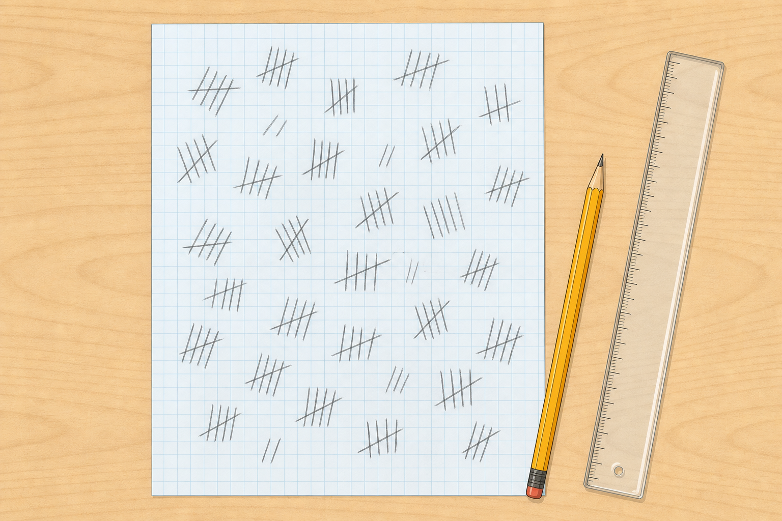
Look at this jumbled list of class readings or tallies. Can you tell which category came out highest? Beside it is a blank table outline we will fill later. Which version would you trust if you had to report a clear answer?
Today we turn our real class dataset into a clear table and a chart, then say what the chart actually shows.
Show two versions of the same small set of numbers on the board: a jumbled list and a blank two-column table outline (headers only, no filled cells yet). Do not yet reveal a finished chart or a completed comparison table. The pupil screen matches this: jumble plus blank grid.
Quick hook question: match it to today's prepared dataset only. For light or place readings: Which place looks highest from the jumble alone? For a play-time survey: Which band looks most common from the jumble alone? Take three or four answers; do not teach the key words yet.
Before the lesson (not inside the 5-minute opening): have the class dataset ready as a raw list on the board or on paper (micro:bit logs or readings from earlier in this unit). If no prior dataset exists, run the two-minute class survey before the bell or in the first minute as start-of-lesson prep, so the 5-minute Getting Started is only the compare-hook and naming of an already-tallied dataset. Suggested survey: How many minutes of outdoor play did you get on your last school day? Tally answers into bands the class agrees (for example 0–15, 16–30, 31–45, 46+) and leave that tally visible as today's dataset before the hook begins.
Name today's shared dataset aloud at the end of the hook so later steps are not guessing which evidence is in play.
Here is a messy list of class readings or tallies. We will organise it together so the story stops hiding.
A jumbled list is still a dataset (readings or answers gathered for a purpose), but it hides the story. A table gives every value a labelled home (each label is a category we name together). A chart turns that table into a picture so a pattern can jump out.
We will model it like this: I wonder → I organise → I chart → I think, so the pattern is earned, not guessed.
Average means add the readings in a category and divide by how many there are. With exactly two readings, the middle value and the average are the same.
Why does a jumbled list hide the story that a table and chart can tell?
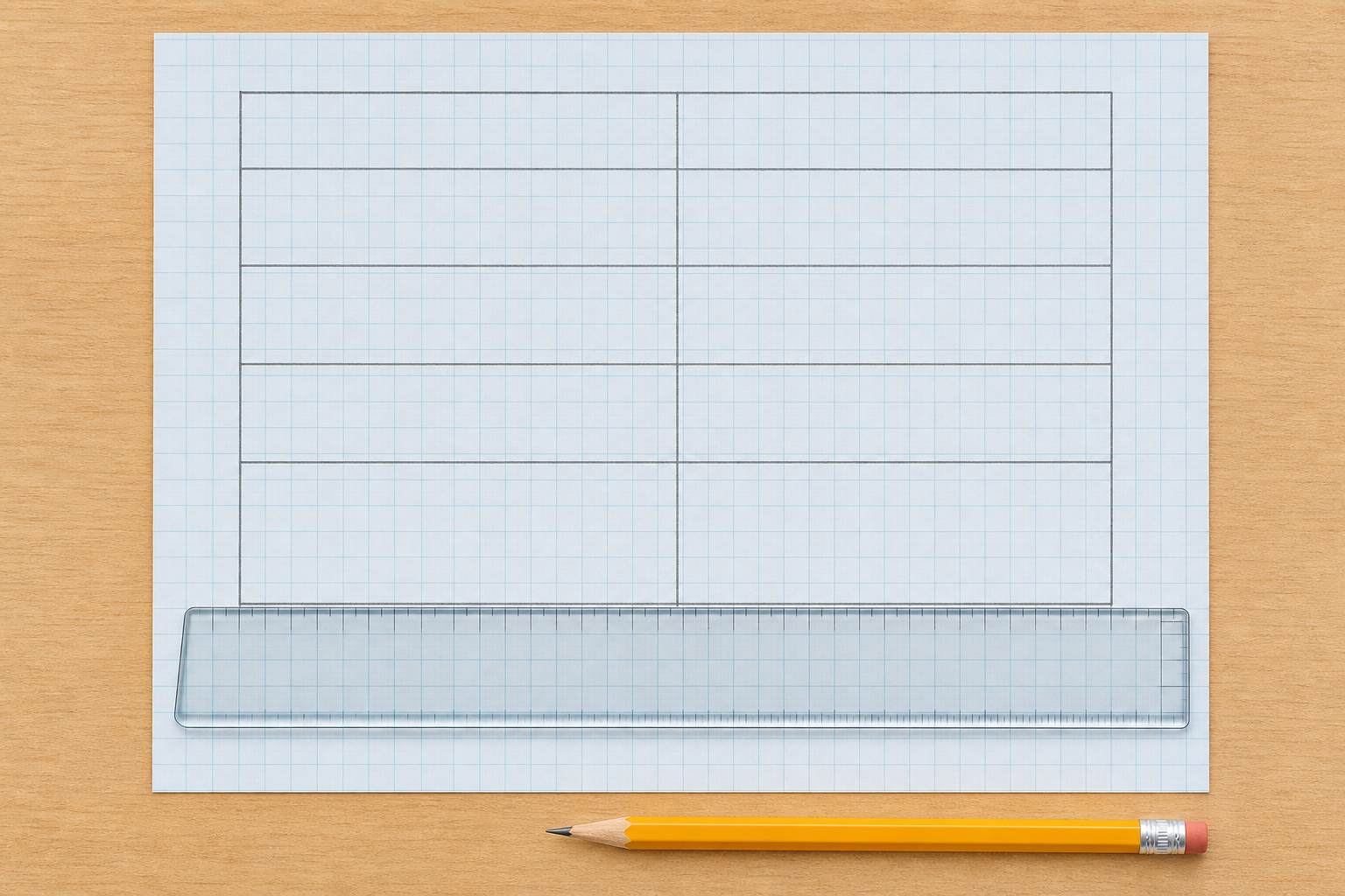
Board stays short. Lead with the tiny worked example first, then hang each word on the moment it appears. Treat table and chart as the load-bearing pair; fold dataset and pattern into the model language rather than as four equal glossary labels.
Keep the live model tight (8 minutes): narrate one average fully aloud, then reveal the other two category values already pre-written so the finished three-row table and sketch chart still fit. Use the concept hang and lock today's shared categories before groups start.
| Concept | Why it matters | Example |
|---|---|---|
| Table — a grid of labelled rows and columns that holds each value in one clear cell | A table lets you compare like with like and spot mistakes before you draw a chart | Category in column 1, organised value in column 2 |
| Chart — a picture of the table (often bars) so differences stand out at a glance | In the digital world, people decide from charts; a clear chart turns numbers into a message | Tallest bar = highest value for that category |
| Dataset — a collection of measurements or answers gathered for a purpose | Raw readings alone do not answer a question until someone chooses what to keep and how to group them | Micro:bit readings, or tally marks from a class survey |
| Pattern in data — what the organised numbers show once you can compare them fairly | Scientists and engineers separate what they see in the chart from what they think it means | "This bar is tallest" (observation) versus "so that category stands out" (inference) |
Pick the example that matches today's real dataset. Do not leave a light-place story on the board if the class is using survey bands.
Option A — place / light readings (use only if that is today's dataset):
Option B — outdoor-play survey bands (use if that is today's dataset):
Point at the shared class dataset and name the categories the class will use today. Groups will not invent their own category set.
Misconception to head off: a pretty chart is not automatically true. If categories are mixed or averages are wrong, the chart misleads. Organising carefully comes first.
Nature of STEM: data only means something when people select, organise and present it. That is everyday work for scientists, engineers and anyone reading digital dashboards.
Your group will take our shared class dataset and the categories we agreed. Use today's default method (average, unless a category has a simple count already). Write the unit, and build a neat two-column draft table so each number has one home. Match the model header pair on the board for today's dataset.
When your draft table is filled, predict something the table alone does not settle: which gap between categories will look biggest once the numbers become bars, or one thing a chart still will not prove. Say why.
Name the shared dataset out loud (for example micro:bit light or temperature readings gathered earlier in this unit, or the survey tally already on the board from before-lesson prep). Write the raw list or hand back each group's journal notes so everyone works from the same evidence.
Whole-class decision (do this before groups work): agree one shared question and one shared set of categories for today (for example place: window, desk, cupboard; or survey bands already tallied). Write those category labels on the board. Every group organises toward that same chartable table so Step 4 can build one class chart without merging incompatible schemes.
Model header pair on the board (required): after categories are locked, write one filled header example that matches today's dataset, for example Category | Average light reading, or Play band | Number of pupils, or Place | Average °C. Groups copy that number-column meaning; they do not invent a rival unit label.
If you used the survey fallback, the bands and tallies are already the dataset — groups focus on neat table layout, units, and checking every tally has one home.
Default method for today: use the average when a category has repeated measurements (add the readings, divide by how many). Treat middle value as a supported option only when a category has exactly two readings (where middle and average match). Do not leave groups inventing a statistic for three or more readings.
Each group must decide:
Circulate and keep groups on the shared question, such as Which place was brightest? or Which time band was most common?
Prediction timing: only after the draft table is filled. Aim the prediction at what the table does not settle alone: which gap will look biggest as bars, or one claim a chart still will not prove. Pupils predict from organised numbers, not from the jumble.
Look-fors: categories match the board list and do not overlap; every value sits in one cell; units match the model header; pupils can say the shared question their table answers; prediction comes after the draft table and targets gap or limit of the chart.
Recording now: draft table on squared paper only. The Investigation Journal page is completed in the later record step, not twice.
Differentiation: support groups with the category labels and model header already on scrap paper; stretch groups by asking whether a second grouping of the same data would change the story (keep that as talk or extension, not a rival class chart).
Before any numbers go in, we will set the unit for the Value column on the interactive table (for example average light reading, number of pupils, or °C). Then we type our agreed categories and numbers. When the table is complete, we will show the bar chart and read it together.
Watch which bar is tallest and shortest. What does that tell us about our shared question?
Drive the data-recorder on the IWB. First beat (required before dictating numbers): set the unit so the chart pupils will copy later is labelled. Type it into the interactive units field, or write the unit into the Value meaning on the board and say it aloud (for example "average light reading", "number of pupils", "average °C", "minutes"). Do not leave Value unlabelled.
Before typing values, nominate one clear source for the class table: either values the class quickly agrees under the shared categories, or one group's draft table the class accepts. Other groups keep their drafts for a brief compare comment ("we got a similar pattern" / "our average differed by…") rather than forcing a silent merge of incompatible numbers.
Pupils call out category names and values; you type. Aim for one agreed class table so the chart is shared for recording and presentations.
What appears on screen: a table with columns Category and Value, five rows, a unit label, and a bar chart built from the Value column. Name those two column headers and the unit aloud before anyone dictates numbers.
If values are averages, say so in the category labels or the unit ("Window average", unit "average light reading").
After Show chart: ask Which bar is tallest? What does that bar stand for? What does the chart not tell us? Keep observation ("this bar is tallest") separate from inference ("so that category stands out for our question").
If a dictated number disagrees with another group's table, pause and check the raw dataset rather than averaging silently on the fly. Keep divergent group work as a short compare note, not a rewrite of the class chart mid-flow.
On your Investigation Journal page, record the organised class table from the board and write what the bar chart on the board shows. Scientists get strict here: first say only what the bars show, then say what you think it means.
This beat is in-class and mandatory before presentations. Keep the finished class table and bar chart visible on the IWB (the data-recorder from the previous step), including the unit label, so pupils copy from the board, not from a missing on-screen picture in this step.
Pupils use their Investigation Journal page for the organised categories and values, what the chart shows, and one sentence on why organising the data mattered.
Prompt stems to say aloud (pupils write on paper, not on screen):
Do not invent extra boxes or column names beyond what the journal page provides. If the class chart has fewer than five categories, they record the ones on the board.
This is the single write-up moment for the table and chart meaning — drafts stayed on squared paper until now.
You're previewing this lesson. Get full access to this lesson and hundreds more — each one ready to teach, with interactive activities, printable resources and pupil progress tracking built in.