Mathematics
Advanced
50 mins
Teacher/Student led
+65 XP
What you need:
IWB/Projector/Large Screen

Critically Evaluating Graphs and Misleading Data

Learn to spot three ways graphs mislead: chopped axes, uneven scales, and sized-up symbols. Read the real numbers, name the trick, and redraw graphs fairly starting at zero.
Teacher Class Feed

Load previous activity

    1 - Getting Started ~4 mins

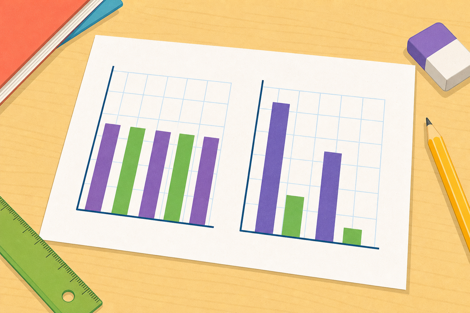
    Illustration for Getting StartedImagine two bar charts drawn side by side, both showing the exact same two numbers. In one, the scale starts at zero and the two bars look almost the same height. In the other, the scale starts at 90 and one bar towers over the other. Same numbers, two completely different stories. How can both charts be honest?
    2 - Watch and Notice ~12 mins

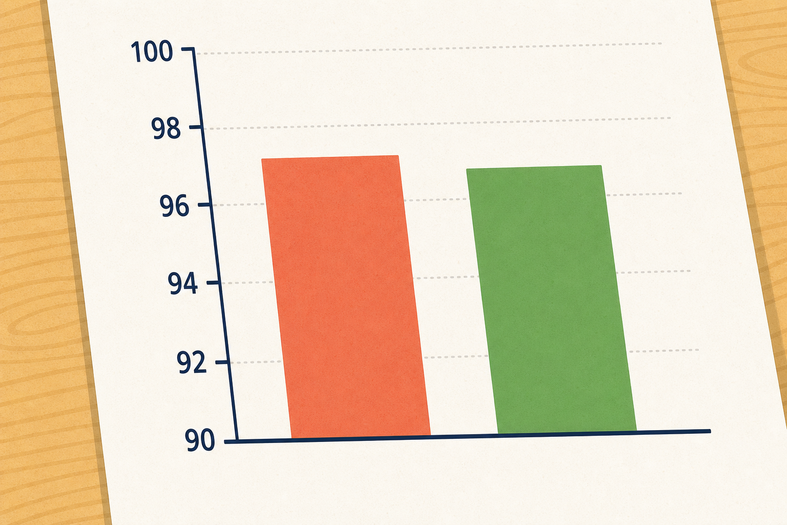
    Illustration for Watch and NoticeYour teacher will walk through three graphs that each bend the truth in a different way. Listen for the real numbers on each one, then look at the picture the graph paints. Watch for where the picture and the numbers disagree.
    Trick 1: The chopped axis

    Trick 2: The uneven scale

    The last one uses no scale at all. It uses pictures of different sizes.

    Trick 3: The sized-up pictogram

    3 - Try It Together ~12 mins

    We'll work through three tricky graphs one at a time. Each bullet below gives you the real numbers. For each one, name the trick and describe what a fair version would look like.

    • A football chart: Team A has 9 wins and Team B has 12 wins, but the Team B bar looks four times taller.
    • A temperature chart with the marks 0, 5, 20, 40 up the side.
    • A pictogram of pets, one dog symbol for every 5 pets: Class 5 has 10 pets (2 symbols) and Class 6 has 15 pets (3 symbols), but Class 6's symbols look much bigger.

    For each of three graphs whose real values are stated, name the trick used and describe what a fair version would show.

    1. Two football teams' wins are shown with the scale starting at 8: Team A has 9 wins, Team B has 12 wins. The Team B bar looks four times taller. What is the real difference, and what is the trick?
    2. A temperature chart has scale marks 0, 5, 20, 40 all spaced evenly up the side. Why can you not compare the bar heights fairly?
    3. A pictogram uses one dog symbol per 5 pets, but Class 6's symbol is drawn twice as wide and twice as tall as the others. Class 5 has 10 pets (2 symbols), Class 6 has 15 pets (3 symbols). Why does Class 6 look far more than 15?

    Ways to start:

    • Start from the actual numbers given in each bullet, not the bar heights.
    • Ask where the vertical scale starts — is it zero, or higher?

    Stretch:

    • For each graph, describe the fair version in words: where would the scale start and what would change?
    Answers & strategies (teacher)
    1. Two football teams' wins are shown with the scale starting at 8: Team A has 9 wins, Team B has 12 wins. The Team B bar looks four times taller. What is the real difference, and what is the trick? — Real difference is 12 − 9 = 3 wins. The trick is a truncated (chopped) axis starting at 8 instead of 0, which makes a difference of 3 look like four times as tall.
    2. A temperature chart has scale marks 0, 5, 20, 40 all spaced evenly up the side. Why can you not compare the bar heights fairly? — The scale is uneven — the jumps are 5, 15, 20 but drawn the same distance apart, so equal spaces do not mean equal jumps and the bar shapes are distorted.
    3. A pictogram uses one dog symbol per 5 pets, but Class 6's symbol is drawn twice as wide and twice as tall as the others. Class 5 has 10 pets (2 symbols), Class 6 has 15 pets (3 symbols). Why does Class 6 look far more than 15? — Class 6 really has 15 pets (3 symbols). Because each symbol is twice as wide and twice as tall, it covers four times the area, so the eye reads area not count and Class 6 looks many times bigger than it should.

    4 - Redraw It Fairly in Your Copy ~3 mins

    COPYBOOK MOMENT

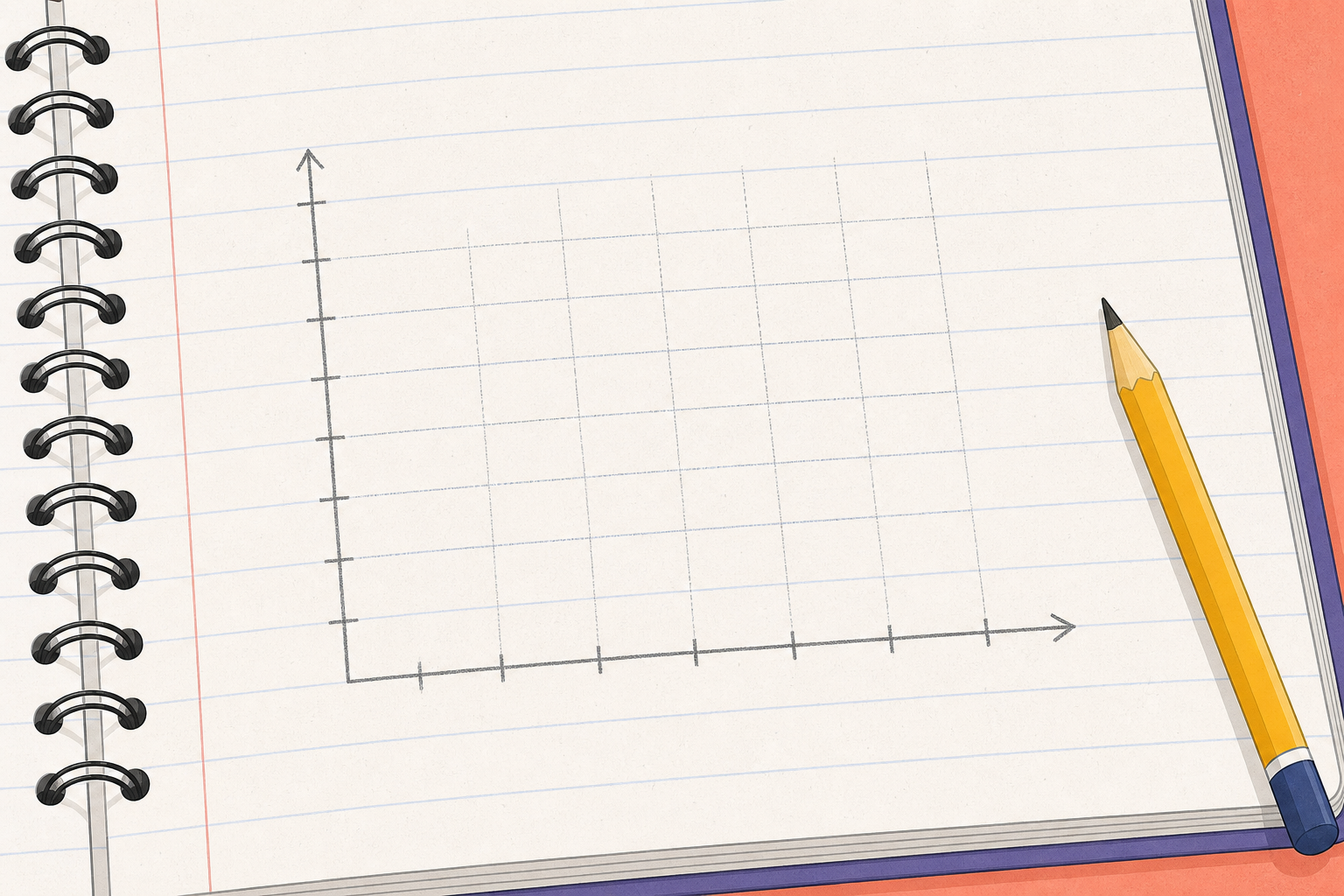
    Illustration for Redraw It Fairly in Your CopyPick one misleading graph from today's lesson. In your maths copy, sketch the same data drawn fairly, using a scale that starts at zero with even gaps, or equal-sized symbols. Then write one sentence naming the trick the original graph used.

    5 - Class Challenge ~10 mins

    Three graphs from adverts and newspapers, each trickier than the last. Each bullet gives you the real numbers. We spot what is misleading, and for the last one we redraw it to tell the truth.

    • A broadband advert with the scale starting at 47: download speed rises from 48 to 50.
    • A survey chart of 'happy customers' with bars for 78% and 81%, a scale starting at 75% with marks at 75, 80, 90, 100.
    • A newspaper pictogram of house prices, one euro-symbol for every €50,000: last year 2 symbols (€100,000), this year 3 symbols (€150,000), but this year's symbols are drawn twice as wide and twice as tall.

    Spot what is misleading in three media-style graphs of rising difficulty, then redesign the last one to be honest.

    1. A broadband advert shows download speed rising from 48 to 50, with the chart's scale starting at 47. The old bar sits 1 unit above the axis and the new bar sits 3 units above, so the new bar looks three times taller. What is the trick and what is the real rise?
    2. A survey chart of 'happy customers' has bars for 78% and 81%, a scale that starts at 75%, AND marks spaced 75, 80, 90, 100. Name both tricks used at once.
    3. A newspaper pictogram shows house prices with one euro-symbol per €50,000. This year is 3 symbols (€150,000), last year was 2 symbols (€100,000), but this year's symbols are drawn twice as wide and twice as tall. Redesign this graph so it is honest.

    Ways to start:

    • First check where each scale starts.
    • Use the printed numbers in each bullet before you judge the bar heights or symbol sizes.

    Stretch:

    • Redraw the third graph so it is honest — say where the axis starts, whether the scale is even, and how big each symbol should be.
    Answers & strategies (teacher)
    1. A broadband advert shows download speed rising from 48 to 50, with the chart's scale starting at 47. The old bar sits 1 unit above the axis and the new bar sits 3 units above, so the new bar looks three times taller. What is the trick and what is the real rise? — The trick is a chopped axis starting at 47. On that axis the old bar is 1 unit and the new bar is 3 units, so it looks three times taller — but the real rise is 50 − 48 = 2, out of 48, a tiny change made to look huge.
    2. A survey chart of 'happy customers' has bars for 78% and 81%, a scale that starts at 75%, AND marks spaced 75, 80, 90, 100. Name both tricks used at once. — Two tricks: a truncated axis (starts at 75%, not 0) and an uneven scale (jumps of 5, 10, 10 drawn the same size). Together they exaggerate a 3% difference badly.
    3. A newspaper pictogram shows house prices with one euro-symbol per €50,000. This year is 3 symbols (€150,000), last year was 2 symbols (€100,000), but this year's symbols are drawn twice as wide and twice as tall. Redesign this graph so it is honest. — Real values: €100,000 last year, €150,000 this year — a rise of €50,000 (one extra symbol). Honest redesign: keep every symbol the same size, use 2 symbols for last year and 3 for this year, or draw a bar chart with the scale starting at €0 and even gaps.
    Pupil practice
    Module 9 · Data and Chance Mixed
    Lesson 100 · Critically Evaluating Graphs and Misleading Data
    Download Activity Book page (PDF)
    123learn · Online learning platform

    Unlock the full learning experience

    You're previewing this lesson. Get full access to this lesson and hundreds more — each one ready to teach, with interactive activities, printable resources and pupil progress tracking built in.

    Hundreds of curriculum-aligned lessons
    Interactive activities in every lesson
    Printable resources & progress tracking
    Copyright Notice
    This lesson is copyright of Coding Ireland 2017 - 2025. Unauthorised use, copying or distribution is not allowed.
    🍪 Our website uses cookies to make your browsing experience better. By using our website you agree to our use of cookies. Learn more