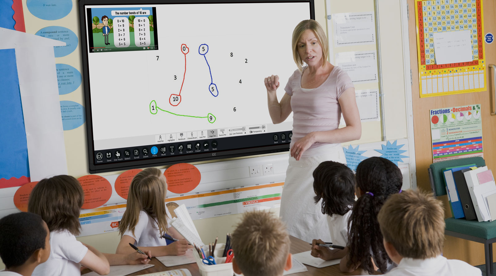
This module we have posed questions, tallied data, drawn bar charts and pie charts, and worked out the mean, median, mode and range. Today you put it all together into one poster that answers a single question: what does our class look like?
This is the fun one. By the end you'll have a poster that shows off exactly who 5th Class is, in a single glance.
What one question would tell a visitor the most about us? Let's agree on our class question now so we can collect the data together.
Take three hands-up suggestions, not open call-outs, and settle on one class question here so Try It Together can open straight into collecting the data. Steer toward a question with three to five clear categories (how you get to school, favourite sport, pets at home) — one with too many categories makes a messy pie chart later.
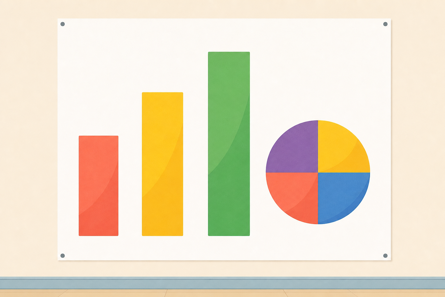
Here is one class's data shown two ways at once. The same survey — how 5th Class gets to school — appears as a bar chart and as a pie chart, with a summary-stats panel beside them.
Notice that the tallest bar and the biggest slice tell the same story. The bar chart shows you the exact count for each way of travelling; the pie chart shows you each way's share of the whole class. Both belong on your poster.
Point to the tallest bar and then to the biggest slice, and say the same category wins in both. Draw out the difference: the bar gives the exact number, the slice gives the share of the whole. Sketch the summary-stats line on the board beside the chart, naming the mode and the range (tallest count minus shortest). Hold off on the pie-chart method here; you build the count-to-slice step live in Try It Together.
We already agreed our class question, so let's collect the data live and build it on the board together.
We'll work in order: tally the class, read off each count, then choose the best y-axis step and draw the bars.
Next we turn one count into a pie-chart slice, so you can do the same with your own data. Take a category's count, divide it by the whole class, and that gives its share of the circle. Here is an easy one to see the method: imagine a class of 28 pupils where 14 walk. Half the class walks, so the Walk slice fills half the circle (180°). If 7 of those 28 cycle, that is a quarter, so the Cycle slice is a quarter of the circle (90°). Our own class total will be different, so we will divide by our number when we build ours. Big count, big slice.
Last, we work the summary line together. The mean is the total divided by how many values there are; the median is the middle value once they are in order; the mode is the most common; the range is the biggest count take away the smallest.
Talk this one through together — pupils take turns at the board and the class agrees or corrects out loud.
Run a quick hands-up tally for the agreed question, writing each category's count on the board. Ask the class which y-step reads best (usually 2 for a class of about 28), then draw only two or three bars to model it — no need to draw all of them.
Now build the count-to-slice step on the board using the clean illustration: write 14/28, say it aloud as half the circle, and shade half a circle (180°). Do the quarter (7/28 → 90°) so pupils see the method twice. Stress that this is a tidy example to show the method; when the class builds its own, divide each count by your real class total, which will not be exactly 28. This is the move they need for their own pie chart, so make it visible.
Finish with a quick mean and median on the board using the counts you collected, then name the mode and range. Watch for the pupil who wants every category to have the same slice — remind them the slice size follows the count.
In your maths copy, sketch your poster layout: draw a box where the bar chart will go, a box where the pie chart will go, and a box for your summary stats (mean, median, mode, range). Write your headline figure in the centre.
Walk the room glancing that every pupil has all three boxes plus a centre headline — no marking, this is whole-class copybook planning, not assessment. Nudge anyone who has filled a box with detail: this is the layout sketch, the real chart comes on the poster.
Now build your own survey poster — this is where your class comes to life on a page. Choose your question, use the class data (or your own three-to-five-category data), and put a bar chart, a pie chart and a summary-stats panel on one page. Write your headline finding big in the middle.
Your must-do floor is the bar chart and the headline sentence — get those done first. Then build up if there is time: (1) draw the bar chart with a sensible y-step; (2) write your headline finding as one clear sentence; (3) turn the same data into a pie chart, biggest slice first, using the count-over-total method we did together; (4) fill the summary panel with the mean, median, mode and range; (5) as a stretch, add a comment on whether your data is spread evenly across the categories or bunched into one.
This step is individual desk work: pupils build their own poster while you circulate. The tasks build up in difficulty — every pupil should manage the bar chart and headline; the pie chart and summary panel stretch the middle group; the even-versus-bunched comment challenges the strongest. Prompt struggling pupils to use the class data rather than invent their own. For a pupil who is less secure, point them back to the board example and let them copy the bar-chart structure with their own numbers, and remind them of the count-over-total method for their first slice. Do not collect or grade in the lesson — the poster is banked afterwards.
You're previewing this lesson. Get full access to this lesson and hundreds more — each one ready to teach, with interactive activities, printable resources and pupil progress tracking built in.