Computer Skills
Beginner
60 mins
Teacher/Student led
+80 XP
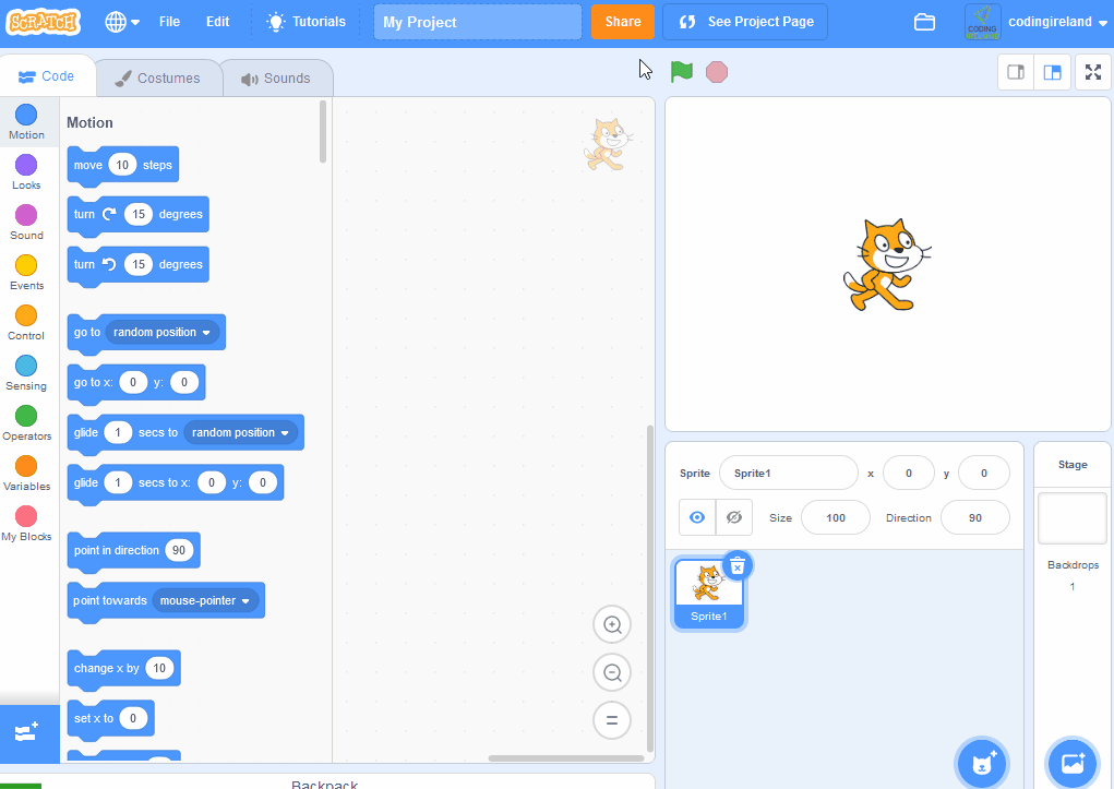
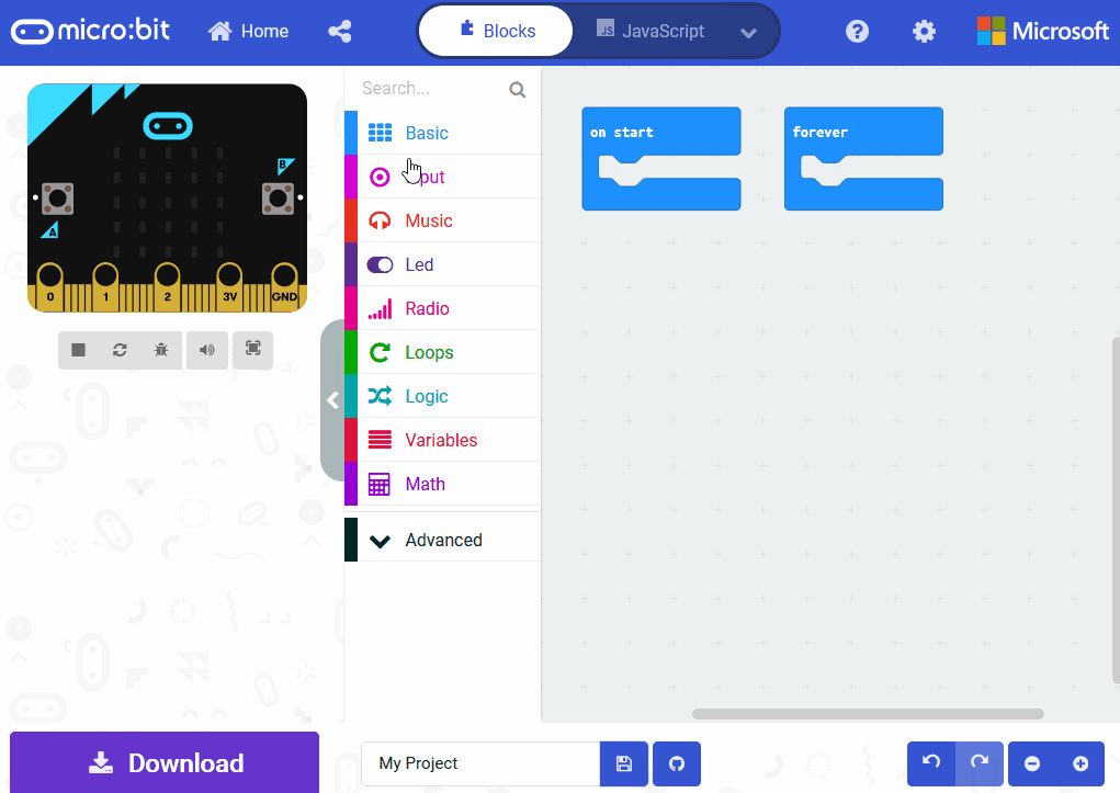
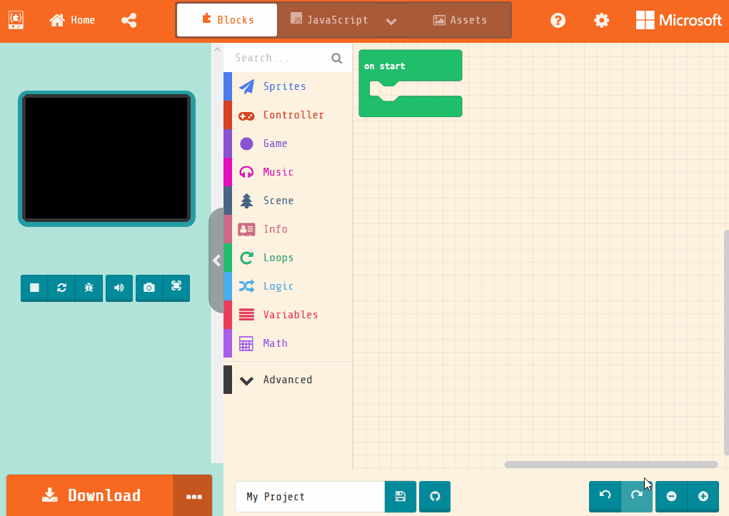
 Chromebooks, laptops, and PCs are crucial tools for coding and digital skills education. Chromebooks are ideal for web-based applications and collaborative projects, while laptops and PCs support a wider range of programming environments and software for more intensive tasks like software development and data analysis.
Seeing the Story — Charts, Filters & IF
Learn to sort, filter, and chart your spreadsheet data to uncover patterns and make real decisions. You'll build formulas, highlight important values, and create charts that actually change something about your project.